Making Interactive Maps From Spreadsheets Using Geosheets
NOTE
Interactive Maps with Geosheets
It’s quite common to work with geo-tagged data in a spreadsheet and want to either map your data or do geospatial lookups to find attributes like the states of zip codes of your locations.
Typically this involves installing other software and then doing a one-way export of your data. Every time your data changes, you have to repeat the process and export, and often import the results back into your spreadsheet if you’re doing further analysis.
Geosheets is a tool that allows for both mapping and geospatial queries to be done directly within Google Sheets, by adding a suite of custom geospatial functions.
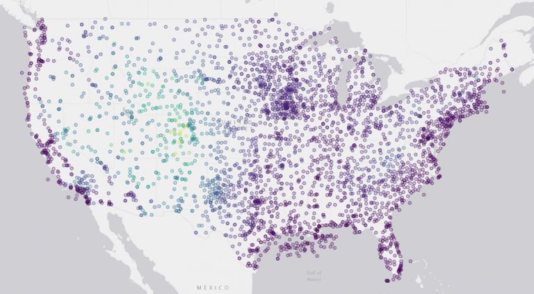
Here we’ll walk through a demonstration of importing tabular data from a CSV file and creating a map visualization using Geosheets. We’re going to map a set of surface weather stations in the continental US and color-code them by elevation. The only prerequisite is to have a Google account so that you can use Google Sheets.
1. Create a new spreadsheet with Geosheets enabled.
Either install the Geosheets add-on (recommended) or make a copy of the demo template that has a demonstration version of Geosheets enabled.
2. Import the sample data into your sheet.
In cell A1 of your sheet, write this formula:
=IMPORTDATA("https://www.geosheets.com/static/samples/continental-us-weather-stations.csv")IMPORTDATA is a Google Sheets built-in function that takes the URL of a CSV file and imports it directly into your document. The URL used here is a sample sheet hosted by Geosheets containing weather stations and their elevations. In just a moment you should see your sheet populated with 4 columns and about 3000 rows of data.
The source of this data is at http://weather.rap.ucar.edu/surface/stations.txt, a list of worldwide weather stations and some of their attributes. The sample CSV is an extract from that master list with just the relevant stations and their coordinates.
3. Add Type and Radius columns to render stations as circles.
By default, Geosheets is going to render points as teardrop markers, but there are so many of them in this dataset that it will be easier to visualize them as circles.
Add a header cell to column E called “Type”. In cell E2 write the value “circle”, and then paste it all the way down column E. “Type” is a special column header that Geosheets understands that indicates how to render a feature. Supported types are values like “marker”, “circle”, “line”, or “geodesic”.
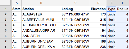
Add a header cell to column F called “Radius”. In cell F2 write the value “4” and paste it all the way down column F. The Radius column tells Geosheets the radius in pixels to render a circle feature.
4. Color-code the features by elevation.
We want to show higher-elevation stations in brighter colors than lower-elevation stations, so we want to assign colors based on the numeric values in the Elevation column.
Add a new header cell to column G called “Color”. Then in cell G2 write this formula:
=GEO_COLOR_FROM_PALETTE(D2:D3419)This is a Geosheets function that takes a column of numeric values, figures out the min and max values, and then assigns a color for each value based on where it falls within that range. Colors are chosen from one of four predefined palettes that both look nice and show contrast clearly. We didn’t specify a palette name so colors will be assigned using the default “Viridis” palette, but you can optionally pass another palette name, one of “inferno”, “magma”, or “plasma”.
5. Add a Label column with text to show on hover.
When you click on a feature on a Geosheets map, an info bubble will pop up with all of the row data for that feature, but you can also define a custom label to show up when hovering with the mouse over a feature. You simply add a column called Label and put your desired text in that column.
We’ll show the station name and its elevation on hover. Add a new header cell to column H called “Label”. We’re going to label each feature with the name of the station and its elevation. In cell H2 write this formula:
=PROPER(B2) & " - Elev: " & D2 & "m"This formula pulls the station name from cell B2, then uses the built-in PROPER function to capitalize it properly and make it read a little easier. Then the formula appends text labeling the elevation and pulls the elevation itself out of cell D2. So the result of the formula is “Alabaster – Elev: 173m”.
Now copy and paste this formula all the way down column H to populate labels for all rows.
6. Create the map using the GEO_MAP function.
In cell I1 or any empty cell, write this formula:
=GEO_MAP(A1:H3419, "contintental-us-weather-stations", "LatLng")The first argument is the data range to use for mapping; here we pass our entire data table including the header columns. The second argument is just a label to identify the map, and it will form part of the resulting map’s URL; this can be any string. The third argument is the header for the column that will contain locations to map; the location column can contain coordinates as it does here, or addresses or place names as well. The third argument is optional, and can be omitted if your locations are in the first column in your table, or in a column called “Location”. Here our locations were in a middle column called “LatLng” so we needed to include it.
In just a moment the formula should evaluate the URL of your new map. If you’re using the Geosheets add-on, you’ll see an auto-updating preview of the map in the sidebar at the right of your document. Otherwise, click through on the URL to see the full-page map.
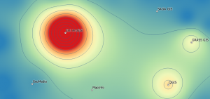
Output
The final map should look something like this:

From the sidebar or the full-page map, you can change settings about the map, like its title, description, and base map tile layer. We’ve changed the base map layer to Gray to better show the features and their colors.


GeoSheets isn’t working at all. Is their site simply down, or is this no longer available?
GeoSheets isn’t working at all. Is their site simply down, or is this no longer available?