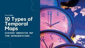
Time in Maps: 10 Types of Temporal Maps
Some maps are timeless. While others, well, they have time in them. This list of 10 ways to show time in maps for temporal maps.
Some maps are timeless. While others, well, they have time in them. This list of 10 ways to show time in maps for temporal maps.
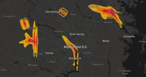
Noise pollution mapping is a way to show how loud different places are. It uses data to make maps that highlight noisy and quiet areas.
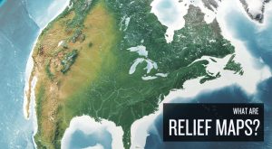
Relief maps are ways to display the Earth’s terrain. It shows the differences in height, like mountains and valleys, using colors and shadows.
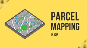
Parcel mapping is key for managing land and planning cities. In GIS, we use tools like parcel viewers and COGO for creating precise mapping.
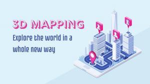
3D mapping is the process of capturing three-dimensional information about the terrain or environment around you to represent the real world.
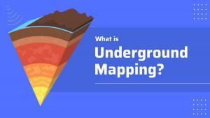
Underground mapping uses a variety of imaging technologies to map subsurface information including oil and gas exploration and utilities.
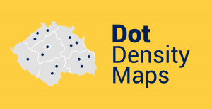
Dot maps use dots to show the density of a particular phenomenon in an area. More dots represent a higher density compared to fewer dots.
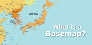
A basemap is a fundamental building block of cartography that provides geographical context to the map and other dataset layers above it.
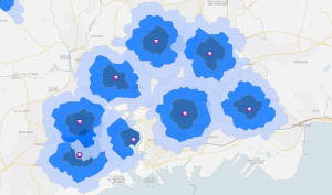
The drive time map is a type of isochrone map that shows you how far you can go based on a start location and an allotted amount of time.
Space-time cubes show how phenomena change over time within geographic space. In a space-time cube, each cube represents a slice of time.