Dot Maps: Map Design with Dots

What is a dot map?
Dot maps are a form of map design that uses dots to show the density of a particular phenomenon in an area.
While more dots within a given area represent a higher value, fewer dots indicate a lower value or density.
But it’s important to understand that dot maps do not show the exact location of the phenomena. Instead, this type of map places dots randomly within an area to show density.
Let’s take a close look at dot maps (also known as dot-density maps) and how you can use them in your map design portfolio.
Dot density map ratios
When cartographers are building a dot map, the first thing you need to consider is the relationship between dots and area. Typically, there are two approaches to dot density ratios on a map.
| Type of Ratio | Description |
|---|---|
| 1:1 | One dot represents a single phenomenon. In this case, one dot might represent one person. |
| 1:M | One dot represents multiple phenomena. For instance, one dot might represent 1,000 people. |
Because each dot represents a quantity, you can expect that when you see more dots, density will also go up. But one of the neat things you can do is to apply colors to dots to show different categories.
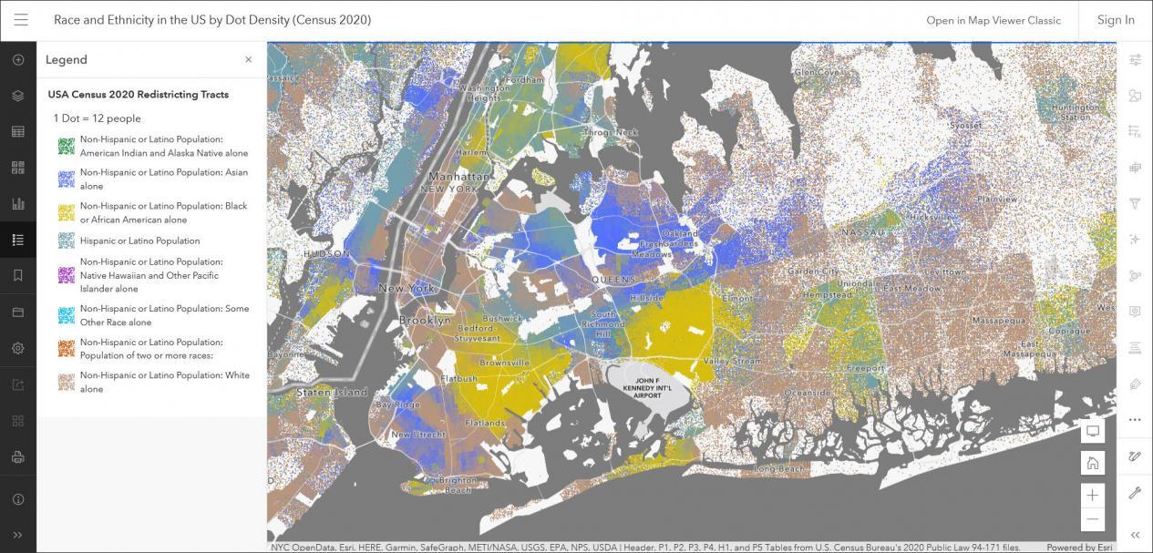
For example, in this interactive US Census dot map, each color represents a different race or ethnicity. Plus, it’s a 1:M type of dot map because one dot is equal to 12 people.
Extracting quantitative data from dot maps
If you decide to create a 1:M dot density map, it’s extremely important to find the right value for what the minimum threshold should be.
If one dot represents 100 people and there are 99 people, then it looks like there’s no one who lives there (when there actually is).
Another disadvantage of using dot maps is that you cannot extract actual quantities from them unless you try counting all of the dots.
Although you might be able to get a rough estimate, it’s easy to misrepresent any total quantity within a given area based on the minimum threshold you select.
READ MORE: Dot Distribution vs Graduated Symbols vs Proportional Symbol Maps
Map design and considerations
Although dot maps are an aesthetically pleasing type of map, the audience often misunderstands their meaning.
For example, if you create a dot map of the number of stores in a state, some readers might think the dots represent the actual store locations on the map.
But what it’s meant to show is the density of a given store across regions. And even though each point is randomly spread out, some map readers might think each dot shows the actual locations too (which is incorrect).
When designing a map, you need to think about how the audience will interpret it. If you’re designing a dot map, this is an inherent problem that can be perceived incorrectly by any reader.


Summary: Dot Density Maps
A map is more than just a simple collection of geographic data. Maps are a powerful tool for conveying complex ideas and information in a clear, concise way.
In the case of dot maps, more dots means a higher value of phenomena. Whereas fewer dots means there is a lower density of phenomena.
Dots can represent different quantities with either a 1:1 or 1:M relationship. But if you create a 1:M dot map, you should choose the minimum threshold wisely and you should know that you can’t always accurately extract quantities from it.
Although dot maps convey the idea of density, some readers might not think the same way as you. This is because the way in which points are randomly drawn in an area can influence the user’s understanding of it.
Overall, there are many different designs for maps, each with its own advantages and disadvantages. Where do you put dot maps on the list?