Map Design – Steal These Cartography Ideas
Building maps is both an art and a science. In this blog post, we’re diving deep into the world of map design.
From typography to color schemes, each element in map design plays a key role. Steal these design ideas to elevate your map-making skills.
Map Layouts in ArcGIS Pro
Looking for a shortcut to get started quickly in ArcGIS Pro? Try out one of their existing layouts.
But how do you do this? First, open ArcGIS Pro. Next, click the “Insert” tab and select the dropdown for “Import Layout”.
These wireframe templates feature both portrait and landscape orientation layouts. It also has a variety of different sizes with background layouts to get started quickly. If you’re starting from scratch, give these layouts a try.
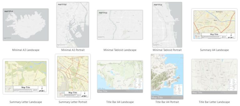
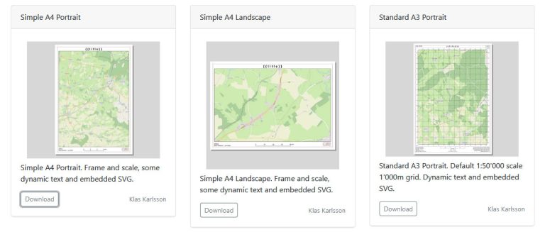
QGIS Layout Hub
Not an ArcGIS user? No problem. The QGIS Layout Hub also has a growing collection of free QGIS layout files (QPT) to import. You’ll find various orientations, sizes, grids, and even layouts for social media.
First, download a layout. Next, find your QPT file and simply drag and drop it in QGIS. It will prompt you to enter a unique title for your print layout. After you enter one in, you can start building your map.
Natural Earth Quickstart
Natural Earth Quickstart is your public domain map-making toolkit. What sets it apart is its global coverage and pre-styled GIS data. Here’s an example of what you’ll see in QGIS with Natural Earth Quickstart.
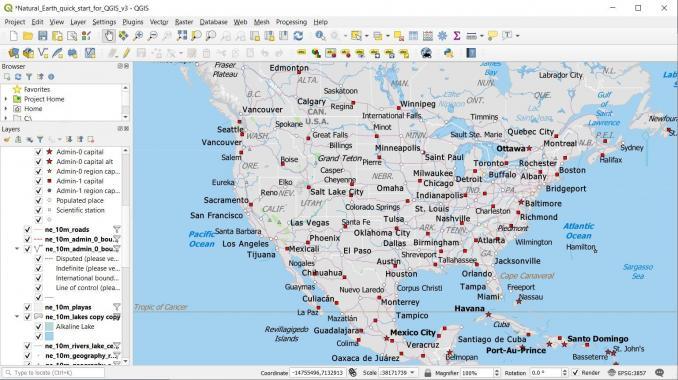
As you can see, it symbolizes your features based on the scale. As you zoom in, the more detail it will show. Map scales are at 1:10m, 1:50m, and 1:110m.
Supported by the North American Cartographic Information Society (NACIS), Natural Earth Quickstart should be part of every cartographer’s toolkit.
Map Types
We’ve covered map types in great detail already. Map types could be the facelift your visualization needs.
Because maybe, it’s a cartogram that can rejuvenate your map. Why not try a distributive flow map to show movement (if that’s what you want to portray)?
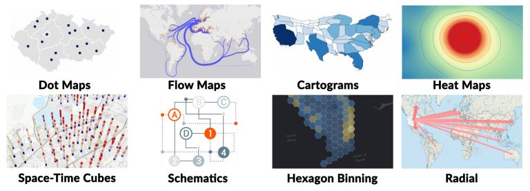
Creativity goes a long way in map design. Experiment with something new and it could pay off big.
We have all sorts of guides to build your own maps. Pick one out and get started today.
Chart Color Combinations
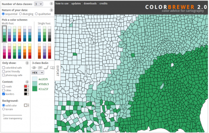
Get inspired by these color combinations. Cartographers should select color palettes that enhance readability.
Try something like ColorBrewer for multi- and single hues. Also, consider color-blind palettes, if that’s your audience.
Muted tones for base maps can help features stand out. For example, Esri’s light gray topographic basemap can really make your features pop. That’s the map design concept for the popularized Firefly cartography.
Style Files
Map design is about finding the right symbology to work with. Whether it’s points, lines, polygons, or raster data, they add clarity and readability to features.
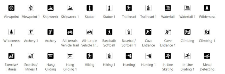
Find out what the pros use. Are you working with national parks data? Then, why not try the NPS symbology?
For Esri, download style files via the Esri ArcGIS Pro Styles page. Meanwhile, the QGIS Styles Repository has hundreds of collections of symbols for QGIS.
Cartographic Conventions for Labeling
Labeling can be tricky at times. But in cartography, we have some rules of thumb. So, if you’re drawing a blank for typography, here are some general guidelines to follow.
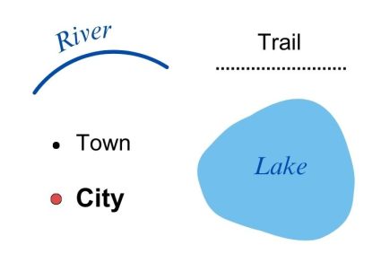
One rule that I like to use is that the font size should always be higher than 6pt. Otherwise, it’s just too small to see the label.
Other than this, did we miss any? Please add other cartographic conventions to our comment section.
Web Mapping and Data Visualization
Remember that not all maps are in print form. Web cartography is extremely challenging. It’s a whole other beast. But to be honest, a lot of the same concepts apply.
In traditional cartography, we create maps at fixed scales. But web mapping allows users to zoom in and out. The key is to focus on readability. When in doubt, opt for pop-ups to avoid overcrowding your online maps.
Lastly, we use story maps for data storytelling. But the key difference is that it adds geographic context. Check out some of these story map examples for inspiration.
Looking for inspiration?
Time for the Cartographer Hall of Fame. Here are some of the top cartographers that I follow today.
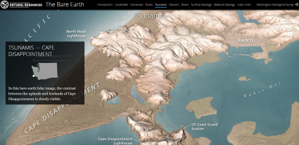
Eduard Imhof – This Swiss cartographer passed away in 1986. But his work carries on, especially his hillshade relief maps.
John Nelson – He’s a cartographer at Esri with a unique sense of humor. Yes, they coexist. I’ve always thought of him as a magician with transparencies and blending colors. Here’s his version of Imhof Maps and YouTube channel.
Kenneth Field – John Nelson’s partner in crime at Esri. Like Batman and Robin, not sure which one is Batman though. Kenneth is known for the Cartonerd blog and is an academic cartographer from the UK. He’s ok, I guess.
You can’t just focus on one or two map design elements like it’s in a vacuum. Instead, it’s a combination of design elements.
Do you want to join the list? Or do you have any other things to say about map design? Please let us know in the comment section below.
25 Map Types for Building Unbeatable Maps
Epic Web Maps – The Maps Hall of Fame
50 Map Projections Types: A Visual Guide
How Map Projections Work
Esri JavaScript API Examples: 15 High-Tech Webmaps and Webscenes
Ocean Currents Map: Visualize Our Oceans Movement
3 Wildfire Maps for Tracking Real-Time Forest Fires
10 Topographic Maps From Around the World