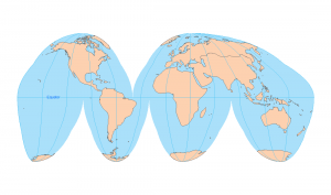
25 Map Types for Building Unbeatable Maps
25 Examples of Map Types
Looking for some cartographic inspiration? Well, I’m a big fan of using different map types.
Unfortunately, the best ones are often overlooked.
But not today.
…Because today we’ll review 25 types of maps that make a huge difference to the map reader.
Each one you can easily add to your mapping repertoire to communicate data more effectively.
Ready?
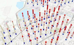
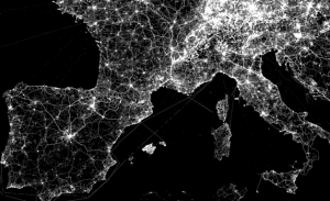
1. Firefly maps
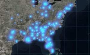
Firefly maps use lightsaber-glowing symbology with a dark desaturated backdrop. Its greatest strengths are its cinematic effects and glowing appeal.
For example, their radiance stands out for earthquake events, transportation networks, and population cluster maps.
2. Dot maps
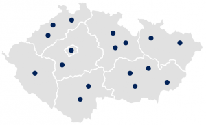
Dot maps scatter dots in an area based on value. More dots means a higher value. And vice versa.
Dot maps don’t necessarily show the exact location. They randomly spread out points in a given area best for showing density differences across regions.
READ MORE: Dot Distribution vs Graduated Symbols
3. Graduated symbols
Graduated symbol maps resize symbols based on value. For example, a small coffee cup pictogram represents low consumption and vice versa.
Symbols include circles, pictograms, and volumetric shapes. For depicting quantity differences, graduated symbol maps are a useful choice.
4. Vector direction maps
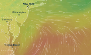
Vector direction maps rotate symbols based on the angle. For example, wind maps use vector arrows that spin how the wind blows.
If you want to depict wind speed, you adjust the size of the arrows. For example, large arrows depict big gusts of wind.
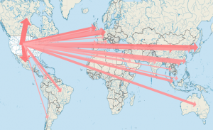
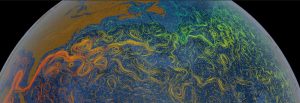
5. Distributive flow
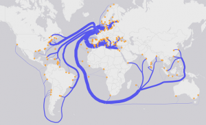
Distributive flow maps curl like fingers branching off to their destination depicting direction and movement.
Although it’s not necessarily the accurate route being traveled, it’s an abstract way of how commodities or information travel from an origin to multiple destinations.
6. Density-equalizing cartograms
Density-equalizing (contiguous) cartograms are your traditional cartograms.
Like all cartograms, they bulge the size of geographic areas from representative values. Although it distorts each feature, each feature remains connected.
READ MORE: Flow Maps
7. Voronoi diagram
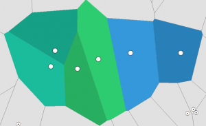
Voronoi diagrams best understand the proximity and distance of features. It starts with seed points that divide regions for each point.
Each region shows the closest region for a point. So If you place a point in any region, then it’s the closest to that seed point.
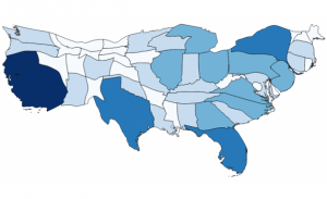
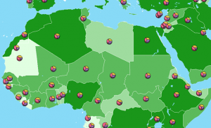
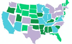
8. Choropleth
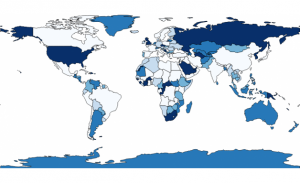
Choropleth maps vary the shading of each area based on its value. It’s one of the most common map types because they’re easy to understand and add a bit of color.
They’re different from heat maps because they require a geographic boundary. We assume the entire boundary is homogeneous with its assigned shading.
READ MORE: Voronoi Diagrams and Thiessen Polygons
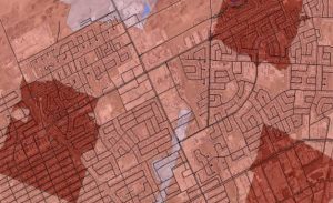
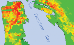
9. Heat Maps (Point-density)
Heat maps color-code using the density of points. For example, if there is a high density of crimes in an area, it shades the area as red.
But fewer crimes are assigned a blue shading. By using this type of map, you can pinpoint the safest and most dangerous places in a city. And they’re not tied to a boundary like choropleth maps.
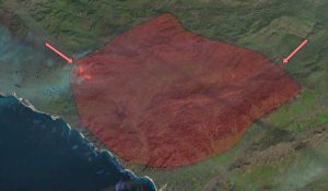
10. Isochrone
Isochrone maps reveal the geographic extent to which one can travel. If you start at a given point, it shades how far you can travel within an amount of time.
For example, fire stations measure their drive-time distances using a city’s road network. If they know which areas they have difficulty providing service for, it gives insight into where to build new fire stations.
READ MORE: Isochrone Maps
11. Dasymetric
Dasymetric and choropleth maps are both thematic mapping techniques. But dasymetric maps classify quantitative aerial data.
For example, the population can be aggregated into areal census tracts. In a dasymetric map, each census tract is assumed to be homogenous.
12. Space-time cubes
Space-time cubes are slices of time stacked up in a three-dimensional space. Older time cubes are on the bottom. New slices of time are on top.
So they’re ideal to show how values change in geographic space. For usability, it takes time to get accustomed to it. But in terms of 4D mapping techniques, it’s one of a kind.
13. Topographic
Topographic maps are all-purpose maps. Generally, they include terrain, natural and man-made features. From topographic surveys, we construct these map types.
Fast-forward to today, they still hold tremendous value in infrastructure, military, and resource planning.
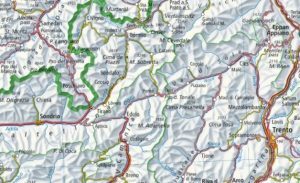
14. Contour (Isolines)
Contour maps have lines with constant values joining points of equal elevation.
If contour lines are closely spaced together, the terrain is steep. But if they are widely spaced apart, it’s a gradual incline.
READ MORE: Contour Lines on Topographic Maps
15. Statistical
Data viz meet maps. When you put bar graphs, pie charts, and line plots on maps, suddenly statistics have a location.
And the saying goes: without geography, you’re nowhere. So with Tableau-style visualizations, you put data visualizations on the map.
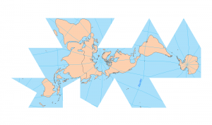
16. Non-contiguous cartogram
Non-contiguous cartograms resize features based on values and keep their shape intact. But features don’t have to stay connected.
They can freely move to scatter them like pieces of a jigsaw puzzle. So features scale up or down according to value. But the tradeoff is that you lose their precise placement.
17. Dorling cartogram
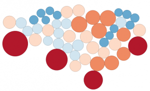
The Dorling cartogram uses shapes like circles and rectangles to depict the area. By using shapes, it’s easier to recognize patterns.
But its main weakness is that you lose its geographic reference. It can get to such a point that you don’t know what you’re looking at.
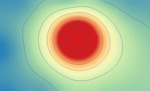
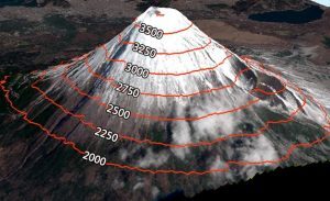
18. Surface maps
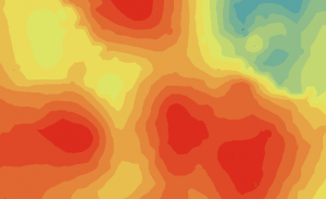
Surface maps take a set of known values. Then, they create a surface predicting the unknown ones in between.
This 3D surface (isopleth) is common for rainfall, temperature, and elevation. They differ from choropleth maps because they’re not tied to a geographic boundary or region.
READ MORE: Cartogram Maps
19. Schematics
Schematics significantly simplifies maps. For example, subway maps, traffic lights, and electric networks use schematics as a simplified view.
At a cost, schematics lose orientation and a true base map. But readers can gain greater clarity.
20. Network flow
Network flow maps show movement along with an established network. For example, flight paths, transportation networks, and communication systems use network flow maps.
The purpose is to display the traffic on the map. For instance, thick lines have a denser flow. But thin lines have less traffic.
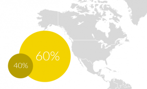
21. Coxcomb chart (Polar area chart)
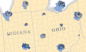
The Coxcomb chart is a twist on the pie chart. Like petals on a flower, each petal is packed with single or multiple slices of information.
For example, petals in a coxcomb chart can radially display months of a year. If the petals are large, it has a higher quantity like this wildlife bird strike map.
22. Timeslice maps
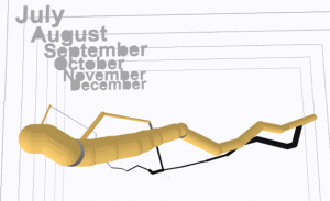
Timeslice maps portray a journey by dividing the map canvas into chunks of time. For example, the path of a tsunami divides the map canvas in minutes.
Napoleon’s March is a timeslice map in three dimensions over days. These types of maps are hard to implement but extremely effective at communicating time.
READ MORE: The Maps Hall of Fame
23. Hexagonal Binning
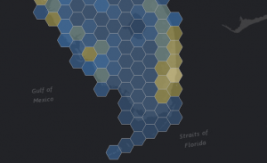
Rather than square grids, the future of mapping is hexagons. Actually, circles make the best grids because their perimeter has equal distances from a center point.
Overall, hexagon binning reduces sampling bias. But you can’t connect neighboring circles into a continuous grid. So this is why we use hexbins for sampling which resemble circles.
24. Word (typography) maps
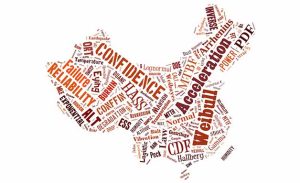
Word maps assign dominant keywords to features filling in the area of the map.
Word placement is key for this type of map in terms of rotation, scaling, and skewing. Large words suggest an influential topic. Whereas small words put less emphasis on a keyword.
25. Radial flow
In radial flow maps, lines radiate from an origin. Then, they radiate outwards to single or multiple destination nodes.
Each hub links the movement of a phenomenon. It has a directional flow line which is often in a radial pattern.
All hail the cartographer
Cartographers are heroes in any organization.
And every hero has a secret.
Don’t go through life keeping yours hidden :)
Let these map types help you discover your full potential to become the hero you’ve always wanted to be.
So which map types are you eyeing in your next masterpiece?
Let us know with a comment below.

This list is not complete. I miss maps with a user friendly non-academic reference grid, see the video on http://www.volksnav.de/aSimpleCircle.
Henrique
Munich Orientation Convention
Henrique, thank you for sharing this information. It is very interesting and an eye opener.
I have used Microsoft Excel to quickly make maps like these Firefly and Heat Maps and plotted thousands of points that had addresses all over the United States with very good accuracy and only a few clicks & little formatting. It can be useful on the fly to quickly analyze data or even drive home a point!
Go to ‘Insert’ -> ‘3D Map’ -> ‘Open 3D Maps’ OR ‘Add Selected Data to 3D Maps’
From there you can select the type of map, data to be included, and a few more useful tools to quickly plot points on a map!
Thanks for a simple brief A to Z digital mapping types.
Thank you. How about more 3-dimensional stuff?
Comprehensive yet concise. Well-written. Thank you :)
Very useful article! Congratulations