5 Types of Color Combinations for Maps
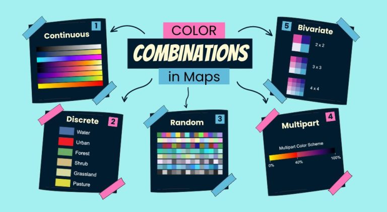
Color Combinations in Maps
Color combinations in maps can make a big difference. They help us understand the map better. Plus, they can help readers grasp information quickly.
There are five main color combinations you should know about. This article will highlight color combinations in maps. You’ll also learn when to use each one.
1. Continuous color schemes
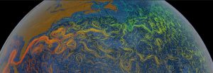
Continuous color schemes show a smooth range of values. They are good for blending colors without sharp boundaries. But because the transition between colors is seamless, it may be difficult to see small differences.
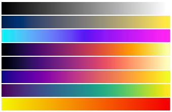
This type of scheme is ideal for data that changes gradually, like temperature or elevation. For example, a map might use shades of blue to red to represent cold to hot temperatures. Heat maps use this type of color scheme.
While continuous color schemes are visually appealing, they require a careful selection of colors. More variation means it can capture more detail. So, the right color gradient can make data stand out or blend in, depending on the goal.
2. Discrete color schemes
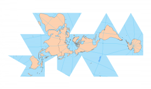
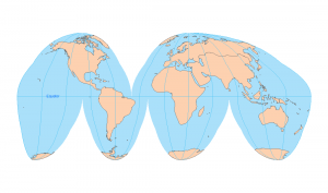
Discrete color schemes use distinct colors to represent different categories or values. Unlike continuous schemes, there are clear boundaries between colors.
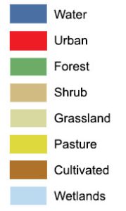
This approach is perfect for maps showing specific groups, like land use types or political boundaries. For example, a map could use different colors to differentiate between forest, urban, and water areas.
Because each color stands alone, it’s easy to distinguish between categories at a glance. Discrete color schemes simplify complex information, making maps more readable. While choosing colors, it’s important to ensure they are distinct enough to avoid confusion.
3. Random color schemes
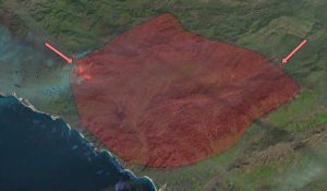
Random color schemes don’t follow a specific pattern or logic in their color choices. They use a variety of colors chosen without a particular order or relationship to the data.
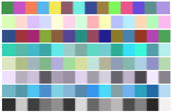
Because the colors don’t relate to data values or categories, interpretation can be more challenging. Random color schemes are best for engaging viewers’ attention rather than detailed analysis.
For example, a map highlighting various festival locations might use random colors to make each spot pop out. So, even though random color schemes can be visually striking, they are less common in professional maps.
4. Multipart color schemes
Multipart color schemes allow you to split a set of values into groups. After you split them into groups, you can apply different color gradients to each one.
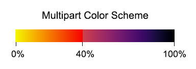
For example, you can apply a yellow-to-red gradient from 0 to 5. Then, you can apply a blue-to-green gradient from 5 to 20. Next, you can continue adding different gradients for above 20.
This type of color scheme works for discrete and continuous data. For breaks, it’s possible to assign each color gradient based on percent values and discrete values.
5. Bivariate color schemes
Bivariate color schemes display two numerical variables. Each variable has its own color gradients. This type of color scheme shows the interaction between these variables by mixing them.
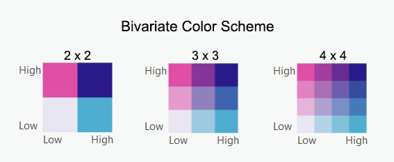
For example, a map could use one color to represent population density and another for average income. Both are values (not categorical data). This creates a unique blend where these variables intersect.
If both variables have high values, it will show a blend of the highest color gradient colors. But if both values are low, then it will display a combination of colors at the low end of the gradients.
What color combinations are easiest to read?
Color combinations that are easiest to read often contrast well and cater to a wide audience. Using patterns or textures in addition to color can also improve readability.
Designers might opt for color palettes specifically tested for color blindness. For example, ColorBrewer contains palettes that are both aesthetically pleasing and readable.
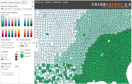
Monochromatic schemes, using various shades of a single color, can also be effective. As long as colors provide enough contrast, these palettes are classic and suit a wide audience.
What is a good color combination for a map?
A good color combination for a map depends on its purpose. For clarity, it’s best to use contrasting colors. This approach helps in distinguishing between areas at a glance.
Try using common conventional color schemes. For example, use cool colors like blues and greens for low values and warm colors like reds and oranges for high values.
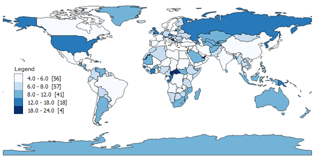
For cluttered maps, consider using a color scheme that includes both bright and muted tones. Bright colors can highlight important areas. Whereas muted tones provide background information without overwhelming the viewer.
Additionally, the choice of colors should reflect the map’s theme. For instance, greens and browns are often used for natural landscapes, while grays and blues might be better for urban maps.
Summary: Color Combinations for Maps
The choice of color combinations in maps impacts their readability, interpretation, and effectiveness. Understanding the various color schemes—continuous, discrete, random, multipart, and bivariate—allows map creators to convey geographic data effectively.
Do you have any questions about color combinations? But remember that before you ask, nothing is set in stone. There are no golden rules that you have to follow in cartography. We’d still love any feedback that you have in the comment section below.

