ArcGIS Heat Map: Kernel Density Tool
The Heat is On
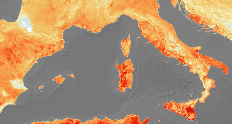
A heat map is a way to visualize data in a geographical area. On these types of maps, the intensity of the color corresponds to the magnitude of the values that it represents.
The ArcGIS Heat map tool is really just the Kernel Density tool, which calculates a magnitude per area from points or polylines using a kernel function.
The darker an area is (such as red), the higher density it represents. For example, you might see this in precipitation maps in a weather report on your news station.
If you want to learn how to create an ArcGIS heat map, then you’ve come to the right place. We’ll show you all the steps on how to use the Kernel Density tool using Esri ArcGIS.
How to Use ArcGIS Heat Maps
In order to use the ArcGIS heat maps tool, you will need to activate the Spatial Analyst extension. You can do this by simply clicking Customize > Extensions.
Next, you’ll want to find the Kernel Density tool by locating it in the ArcToolbox within the Density toolset.
Spatial Analyst Tools > Density > Kernel Density
Once you find and double-click the tool, there will be several parameters that you will have to fill in including the following:
- Input: Input point or polylines.
- Output Cell Size: The resolution you want the heat map to have.
- Population Field: Heat maps are actually meant to use data points that represent a value of 1 for each point. But you can use a value higher than 1 if you want to weigh things heavier than others. By using the population field, this is where you can set your weighted values in the heat map output.
- Output Raster: The heat map raster the tool generates.
ArcGIS Heat Maps Troubleshooting
Even if you set all the parameters, here are some of the common errors you might encounter while using the Kernel Density tool.
Blocky Appearance
If you have a highly pixelated heat map that looks like Minecraft, it means that you likely didn’t set the proper output cell size.
First, we suggest trying to cut your cell size in half. Depending on the quality of the heat map you want to produce, it might take a bit of trial and error to get it perfect.
Output Weighted Areas
If your input point or polylines represent a value different from 1, then you will want to fill in the correct attribute as the population field.
If you don’t set anything in the population field, then the default is 1. But if you have values greater than 1, then this will create output, weighted areas based on the population field.
Remember that ArcGIS isn’t the only GIS software that can output heat maps. Try the QGIS heat map tool, which is equally as good and stylish.