Choropleth Maps – A Guide to Data Classification
What is a Choropleth Maps?
A choropleth map uses different shading and colors based on quantitative data. But the problem with choropleth maps is: There are so many ways to classify your data.
For example, there are equal intervals, quantile, natural breaks, and pretty breaks. But what’s the difference between each of them?
Today, you’ll learn how to pick the best way to classify your data in choropleth maps in our guide to data classification.
Quick Summary
Although each classification method has its strengths and weaknesses, the choice should be based on the data’s distribution. But it can also include the specific goals of your analysis and the visual representation you want to achieve.
Here is a breakdown of the three most common types of data classification methods:
| Aspect | Equal Intervals | Quantile | Natural Breaks |
|---|---|---|---|
| Definition | Divides data range into equal intervals | Divides data into equal numbers of data points | Finds natural groupings based on data distribution |
| Application | Suitable for data with uniform distribution | Useful for reducing extreme values’ impact | Effective for highly skewed data |
| Sensitivity to Extremes | May not represent data distribution well | Helps mitigate impact of outliers | Adjusts intervals around natural clusters |
| Class Counts | Intervals may result in uneven class sizes | Class sizes can vary depending on data | Tends to create classes with varying counts |
| Data Spread | May not reflect data variability | Can capture variability of data | Considers data distribution for class ranges |
| Interpretability | Simplistic, easy to understand | Can obscure data distribution | Reflects underlying data patterns |
| Visualization | May not capture nuances in data | Might not visually represent data well | Reflects data clustering visually |
| Decision-making | Less informed decisions due to equal intervals | May not reveal subtle patterns | Reveals inherent data groups |
Step 1. Choose Your Number of Classes
First, you must aggregate data based on several classes. When you have more classes, you get more variation sometimes making it harder to separate shading. If you want to test out different shading, ColorBrewer has a tool for color advice.
For example, here are 10 classes:
While fewer classes provide less separation between classes such as 5 classes below.

After all, the number of classes you decide on really depends on the purpose of your map.
Step 2. Select Your Data Classification Method
Second, you will have to decide how to classify your data. To put it another way, data classification arranges your data with boundaries to separate classes. You could separate your classes with an equal interval mode:
Alternatively, you could select a quantile type of classifier that arranges data differently (more on this below)
Each data classification technique produces unique choropleth maps. But they all paint a different story to the map reader. The one thing you must realize is that you’re using the same data in each choropleth map, but what’s really changing is how you classify the data.
Step 3. Creating a Choropleth Map
The most important thing you have to realize is that for each of these choropleth maps we create, we use the same data. What’s changing is how we classify the data.
In this example, we count the number of letters in country names. For example:
- Mali, Cuba, Peru, and others are four letter countries.
- Whereas, Bosnia and Herzegovina has 22 characters.
If you plot out 4 to 22 characters, it will have a lot of colors.
For example, the four-letter countries are the lightest shades of green. As the letter count increases, the shading gets darker.
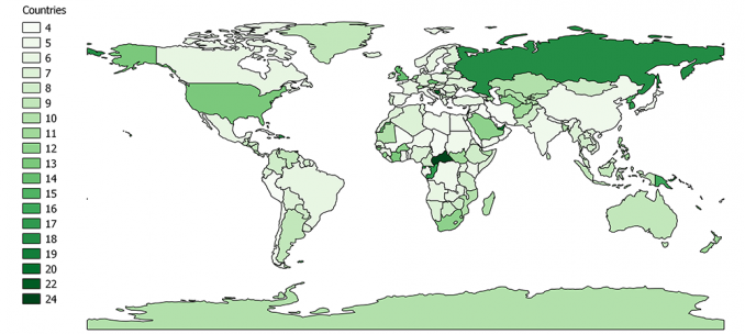
Which country belongs to which group? It’s hard to tell because there are so many colors to differentiate each one.
So this is why we use data classification. When we group by classes, there’s less shading and we aggregate the data by group.
Ultimately, the question is how do we define those class boundaries or bins? In other words, how do we classify the data into groups?
First, let’s try dividing classes into evenly-spaced groupings like equal intervals below and see what happens.
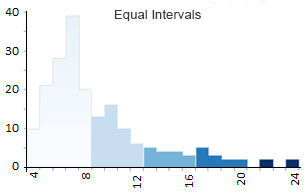
Option 1. Equal Interval Data Classification
The equal interval classification is cut and dry. All it really does is divide the classes into equal groups.
- Class 1: 4 – 8 (113 countries have four, five, six, seven, or eight letters)
- Class 2: 8 – 12 (41)
- Class 3: 12 – 16 (12)
- Class 4: 16 – 20 (8)
- Class 5: 20 – 24 (2)
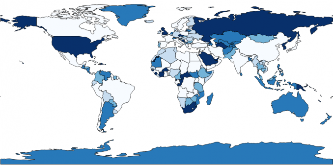
The minimum number of characters of a country is 4 such as Peru. The maximum number of characters is 24, which is the Central African Republic. When you plot each country and its number of characters on a map, it looks like this (the brackets indicate the count):
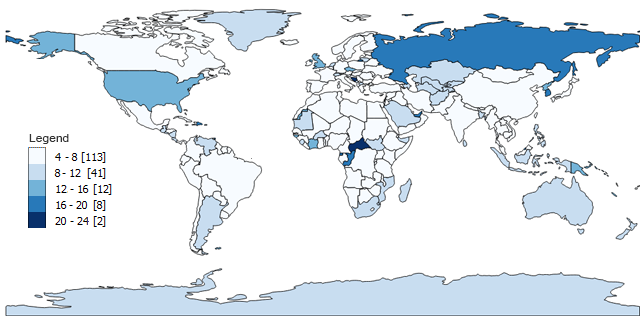
Equal interval data classification subtracts the maximum value from the minimum value (24-4=20). In our example, we generated 5 classes but the number of classes is entirely up to you. Then, it divides 20 by 5 and you get an interval (20/5=4).
Almost always, equal interval choropleth maps result in an unequal count of countries per class. For example, class 1 has 113 countries out of 176 countries with four, five, six, and seven letters.
However, only 2 countries have more than 20 letters. As a result, this map displays more light-shaded colors compared to only 2 with dark shading.
But what happens if you want the count of countries in each class to be close to equal? That’s when you should use a quantile map.
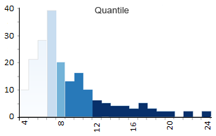
Option 2. Quantile (Equal Count) Classification
The quantile map tries to bin the same count of features in each of the 5 classes. In other words, quantile maps try to arrange groups so they have the same quantity. As a result, the shading will look equally distributed in quantile types of maps.
- Class 1: 4 – 6 (56 countries have 4, 5 or 6-letter names)
- Class 2: 6 – 7 (38)
- Class 3: 7 – 8 (19)
- Class 4: 9 – 11 (36)
- Class 5: 12 – 24 (27)
Quantile maps take the number of features (176 countries in our case). Then, it divides the total by the number of classes to get the average (176/5=35.2). Finally, quantile maps count the quantity in each group and arrange them as close to the average as possible.
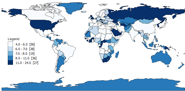
You can see how the count of each class looks very similar and are close to 35.2. For each class, there are not too many or too few for the count.
Despite the balanced style in quantile choropleth maps, they can also be misleading. They are misleading because people tend to look at one of the shades and group it in the same category. For example, a 12-letter country gets the same dark shading as a 24-letter country… and where’s the justice in that?
Option 3. Natural Breaks (Jenks) Classification
The first thing to remember about the Natural Breaks (Jenks) classification is that it is an optimization method for choropleth maps. In short, it arranges each grouping so there is less variation in each class or shading.
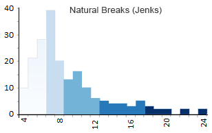
- Class 1: 4 – 6 (56)
- Class 2: 6 – 8 (57)
- Class 3: 8 – 12 (41)
- Class 4: 12 – 18 (18)
- Class 5: 18 – 24 (4)
Natural Breaks (Jenks) takes an iterative approach by comparing the sum of squared deviations between classes to the array mean. Then, the algorithm uses a goodness of variance fit with 1 as a perfect fit and 0 as a poor fit.
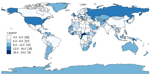
The founder of the Natural Breaks data classification method was a cartographer by the name of George Frederick Jenks. He specialized in monitoring the eye movements of people when looking at a map. And the results for this map looked great too.
You can see how this data classification method minimizes variation in each group. As we have lots of shorter country names, it finds suitable class ranges. But it still manages to group outliers with longer country names in a class of its own.
Option 4. Standard Deviation Classification
Standard deviation is a statistical technique type of map based on how much the data differs from the mean. You measure the mean and standard deviation for your data. Then, each standard deviation becomes a class in your choropleth maps.
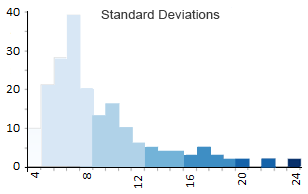
In our case, the mean number of characters is about 8.5 with a standard deviation of 3.7 characters. As a result, all countries with 5 to 8 characters will be placed in the 0 to -1 standard deviation grouping. Likewise, countries with 9 to 12 letters are grouped in 0 to 1 standard deviation range like this:
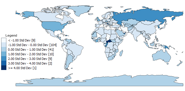
- Class 1: <-1 σ (9)
- Class 2: -1 to 0 σ (104)
- Class 3: 0 to 1 σ (41)
- Class 4: 1 to 2 σ (10)
- Class 5: 2 to 3 σ (9)
- Class 6: 3 to 4 σ (2)
- Class 7: >=4 σ (1)
The raw categories as output need a bit of clarification to the reader. What is the average? What is the range for each standard deviation?
Despite these inconsistencies, standard deviation types of maps might be one of the most appropriate because of their statistical origin. All the 4 letter countries are <-1 standard deviation. Countries with 5 to 8 letters are -1 to 0 standard deviations. The one 24-letter country is >4 standard deviations because of its extreme deviation from the mean of 8.5.
Option 5. Pretty Breaks Classification
If you want round numbers in your ranges, then you should choose pretty breaks. All “pretty breaks” classification does is round each break-point up or down. So instead of having a breakpoint of 599.364, it will become 600,000 with pretty breaks.
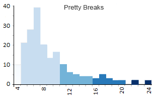
It’s a bit hard to see how round the numbers are (it’s grouping by 5’s) in this example because all the examples above also produce round numbers. But when you have large numbers like population estimates (see below), it will generate some very pretty breaks.
- Class 1: 4 – 5 (29)
- Class 2: 5 – 10 (111)
- Class 3: 10 – 15 (24)
- Class 4: 15 – 20 (10)
- Class 5: 20 – 24 (2)
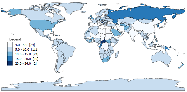
As a result of making rounded numbers, pretty breaks will also be very picky about the number of classes you decide.
Data Classification Types
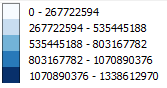
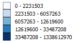
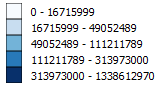
Here’s how population estimates compare when you look at all the data classification techniques:
Equal Interval:
Quantile:
Natural Breaks (Jenks):
Pretty Breaks. Now that’s pretty:
Data Classification: Try It Out Yourself
Choropleth maps use different shading and coloring to display the quantity or value in defined areas.
Often the case, the map maker uses a type of data classification to produce its own unique choropleth map. Each data classification method impacts the reader differently.
There are several ways to classify data in a GIS. We’ve outlined their differences with different examples for choropleth maps. Use this guide to classify practically anything like crime rates, levels of education, and politics.
What is your favorite data classification method? Let us know with a comment below.


Good examples and explanations. Is there a way to create bins that have equal variances? I guess conceptually it would be a bit of a mashup of the quantile and standard deviation methods. Would this method be useful for certain applications?
A clear quide and easy to follow.
One important thing this guide leaves completely out is this: to which class the limit value belongs to?
If the classification is for example
Class 1: 4 – 8
Class 2: 8 – 12
Class 3: 12 – 16
Class 4: 16 – 20
Class 5: 20 – 24
the label claims that value 8 for example belongs both to classes 1 and 2 and missleads the map reader.
Very useful, but didn’t understand the standard deviation part. How did you get stand deviation as 3.7? Please explain.
Great article! Very clear and useful explanations on how to use data classification methods when making choropleths maps and other data-based works. Thank you!
Interesting, but the piece fails to discuss a very important point in classification schemes. From a user perspective, it is always important to remember to classify in a clearly understood format. Use of meaningless percentages have relatively little impact. 13%, 68%, 91% make no statement to the common reader. Conversely, 25%, 50%, 75% are immediately recognized by most individuals and stand out and make a statement.
On choropleth key, please put the highest values at the top not the bottom. Also, next to each class value put the number of items in each class (n=) so the reader can see the distribution of the data.