Dot Distribution vs Graduated Symbols Maps
Click a type of map for more information:

What’s the difference between dot distribution, graduated symbol, and proportional symbol maps?
All three types of maps represent quantities using dots (but it doesn’t necessarily have to be dot symbols).
While dot distribution maps use multiple dots to represent quantity, graduated and proportional symbol maps adjust the size of a single dot based on quantity.
Cartographers often consider graduated symbol maps and proportional symbol maps interchangeably. But these are two different types of maps.
Proportional Symbol Maps
The main idea behind proportional symbol maps is that a larger symbol means “more” of something at a location.
For example:
In a population proportional symbol map, New York will have a larger dot than San Francisco because it has a larger population. And this is also true for a graduated symbol map.
But how proportional symbol maps are different from graduated symbol maps is that symbology is unclassed. In other words, proportional symbol maps scale dots with absolute magnitude.
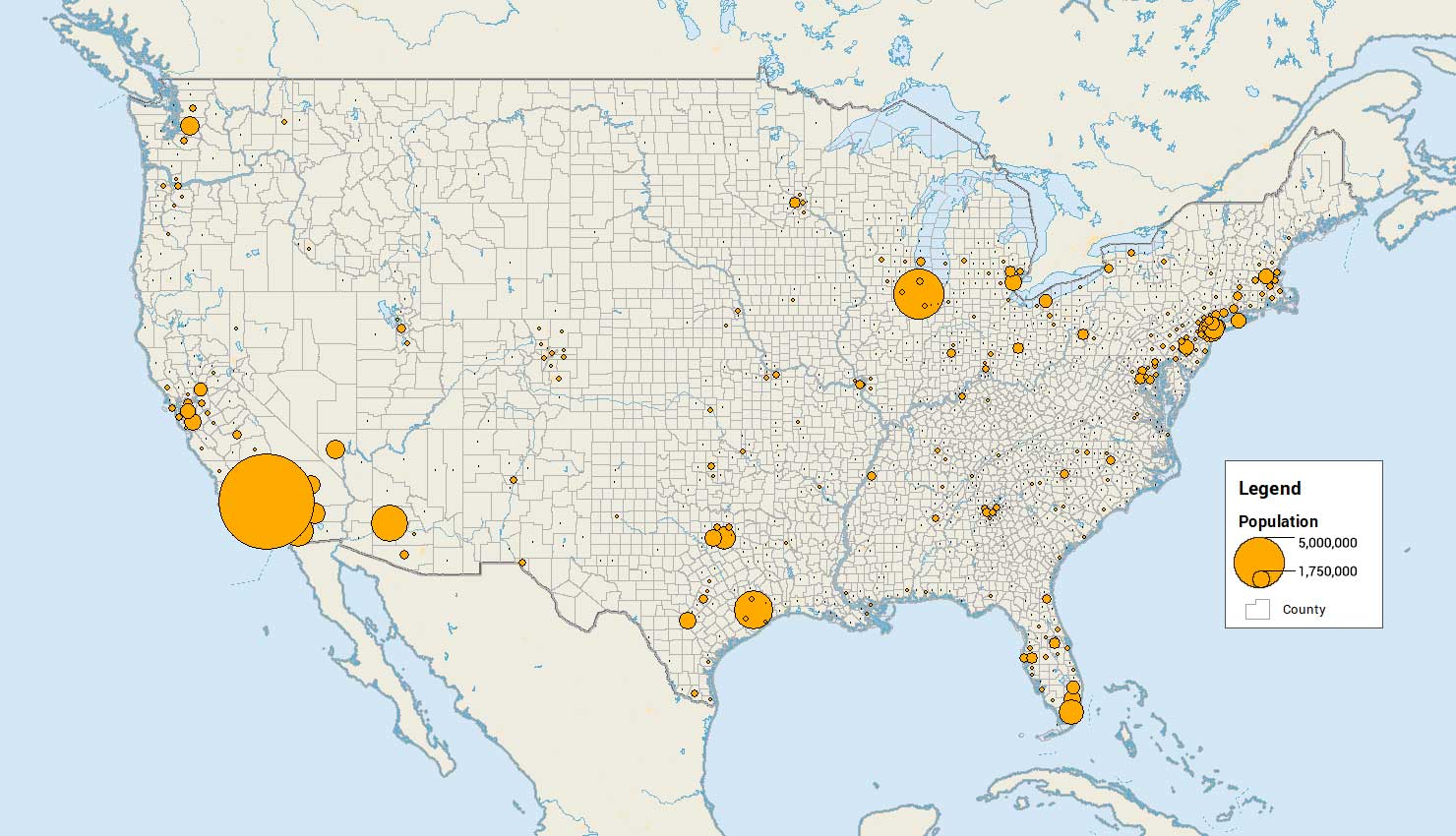
For example, this proportional scale map displays the county population:
In ArcMap, you only set the size of the smallest symbol. From there, each symbol is scaled upwards reflecting the quantity.
If you use Flannery Compensation, it adjusts symbol sizes to compensate for the reader’s underestimated perception of the size of circular symbols.
Graduated Symbol Maps
Similar to proportional symbol maps, graduated symbol maps scale the size of symbols proportionally to the quantity or value at that location. If it’s a polygon, then it’s most likely the centroid for that location.
While proportional symbol maps scale symbols with absolute magnitude, graduated symbol maps divide quantities into classes. It creates classes using data classification techniques like equal interval, quantile, and natural breaks.
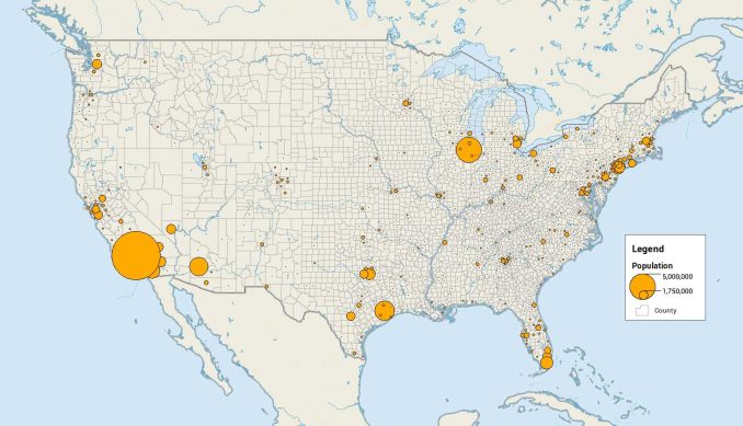
For example, this graduated symbol map divides the population into 4 separate classes. Each of these classes has a specific size dot depending on where the county population falls into.
An advantage of graduated symbol maps over choropleth maps is that the size of the geographic feature doesn’t matter. When you shade by color, people tend to pay more attention to larger features. Often the case, smaller features can get overlooked.
And don’t forget that the symbol doesn’t have to be a dot or square. In general, it’s easier to compare circles and squares compared to other symbols.
Dot Distribution Maps (Dot Density Maps)
Dot distribution maps (or dot-density maps) depict a quantity for a given area by filling it in with small dots. Because each dot represents a quantity, you can expect that quantity every time you see that dot on the map.
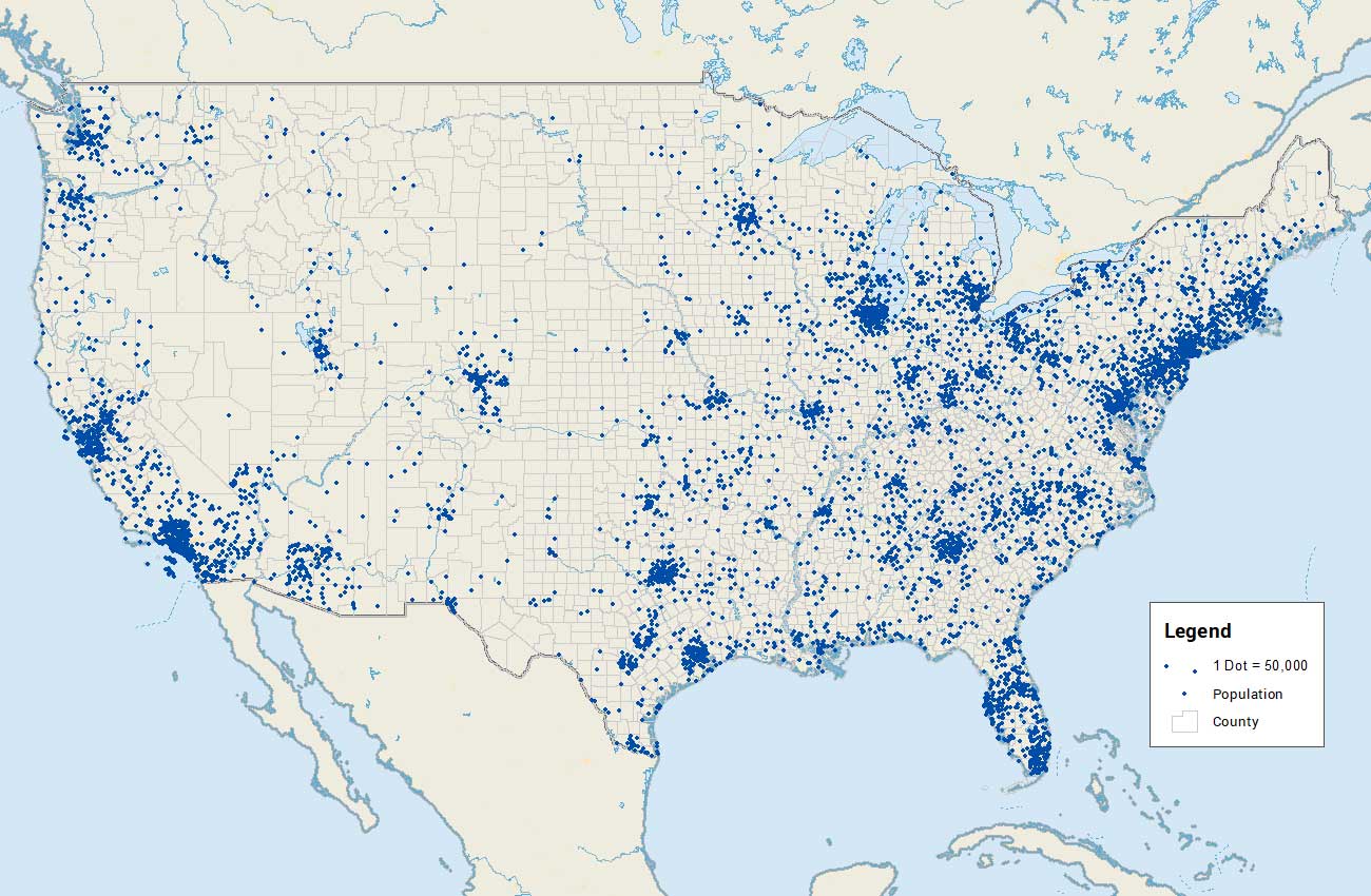
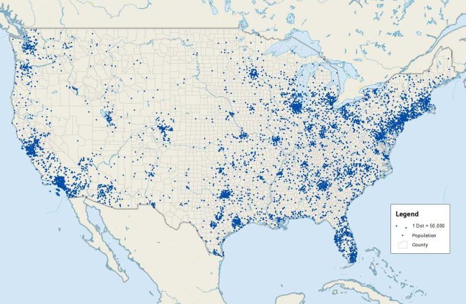
Instead of larger symbols meaning “more” of something like in the previous two maps, dot distribution maps show “more” dots. For example, here is a dot distribution map for US census tracts where each dot is 50,000 people.
If the county doesn’t reach 50,000 people, then the county doesn’t get a dot at all. Thus, finding the minimum value in a dot distribution map is extremely important.
One of the disadvantages of dot density maps is that it’s difficult to extract quantities from them. For graduated symbols or proportional symbols, it’s easy to estimate value based on the size of the symbol. But for dot-density maps, it’s tedious to count small-sized dots for a large quantity.
Dot Distribution vs Graduated Symbols vs Proportional Symbol Maps
All three types of maps represent quantities using dots. But it doesn’t have to be symbolized as dots for symbols.
Graduated symbol maps and proportional symbol maps scale the size of the symbol based on value.
But gradual symbols put each value into a class and scale it based on that “bin”.
Dot distribution maps are different because they just add more dots instead of scaling them larger.