US Temperature Map
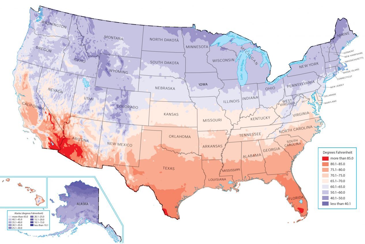
Are you looking to find temperatures across the United States? The map below displays the maximum temperature, which is the average highest temperature (in Fahrenheit) recorded on a daily basis.
US Temperature Map (Maximum)
You are free to use our US Temperature map for educational and commercial uses. Attribution is required. How to attribute?
In general, temperature decreases towards the polar region and increases closer to the equator. Meanwhile, the milder states are in the middle latitudes.
This is why areas like Alaska and closer to Canada are colder. But states like Texas and Hawaii have higher annual mean daily maximum temperatures.
US Temperature Map (Minimum)
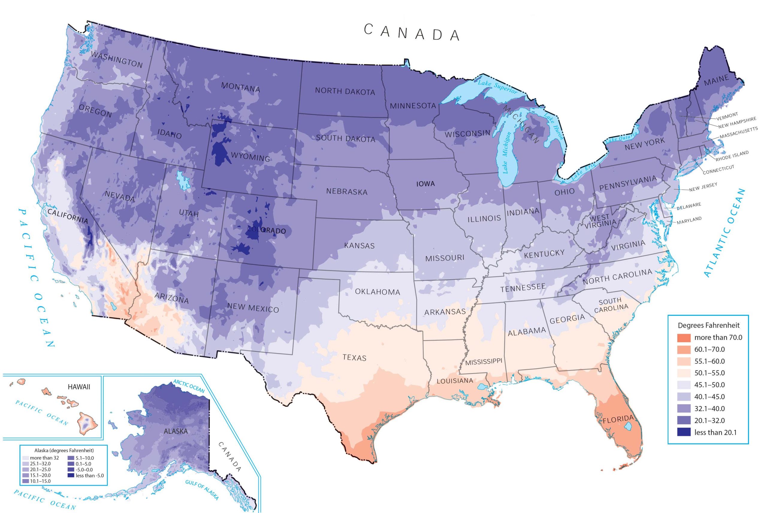
You are free to use our US Temperature map for educational and commercial uses. Attribution is required. How to attribute?
This map displays the mean annual daily minimum temperature, which is the average lowest temperature recorded on a daily basis.
As you can see, states like Wyoming and Colorado have relatively cool climates because of their elevation.
Meanwhile, southern states like Florida and Texas have higher mean annual daily minimum temperatures.
References
Each US temperature map is derived from the National Environmental Satellite, Data, and Information Service, which is a branch of NOAA.
Where can one find a maximum temperature map that depicts the absolute expected maximum, not averages? Something analogous to the hardiness zone map only in reverse, ie show highest expected temps instead of lowest.
agreed, this data is cool, but I would love a map that shows absolute highest and lowest
You should really clearly indicate the time period for this data. If I’m understanding the text correctly, the word ‘current’ or ‘past 24 hrs’ somewhere would be helpful.