How To Create Heat Maps in QGIS
How To Create Heat Maps in QGIS
QGIS heat maps are a type of visualization tool that allows you to see the spatial pattern of data.
They can be used to visualize many different types of data, including population density, crime incidents, and even energy consumption.
Heat maps are very useful in GIS because they allow you to tell stories with your data using a color palette to show any type of concentration.
The following guide will provide you with instructions for creating QGIS heat maps and show some examples of how to use heat maps in GIS.
What You Need
A heat map is typically created by using data points or “samples” from which a color scheme is assigned and then mapped out on a scale.
These samples represent the degree of variability within geographic space and their density determines how intense the color will appear on the map.
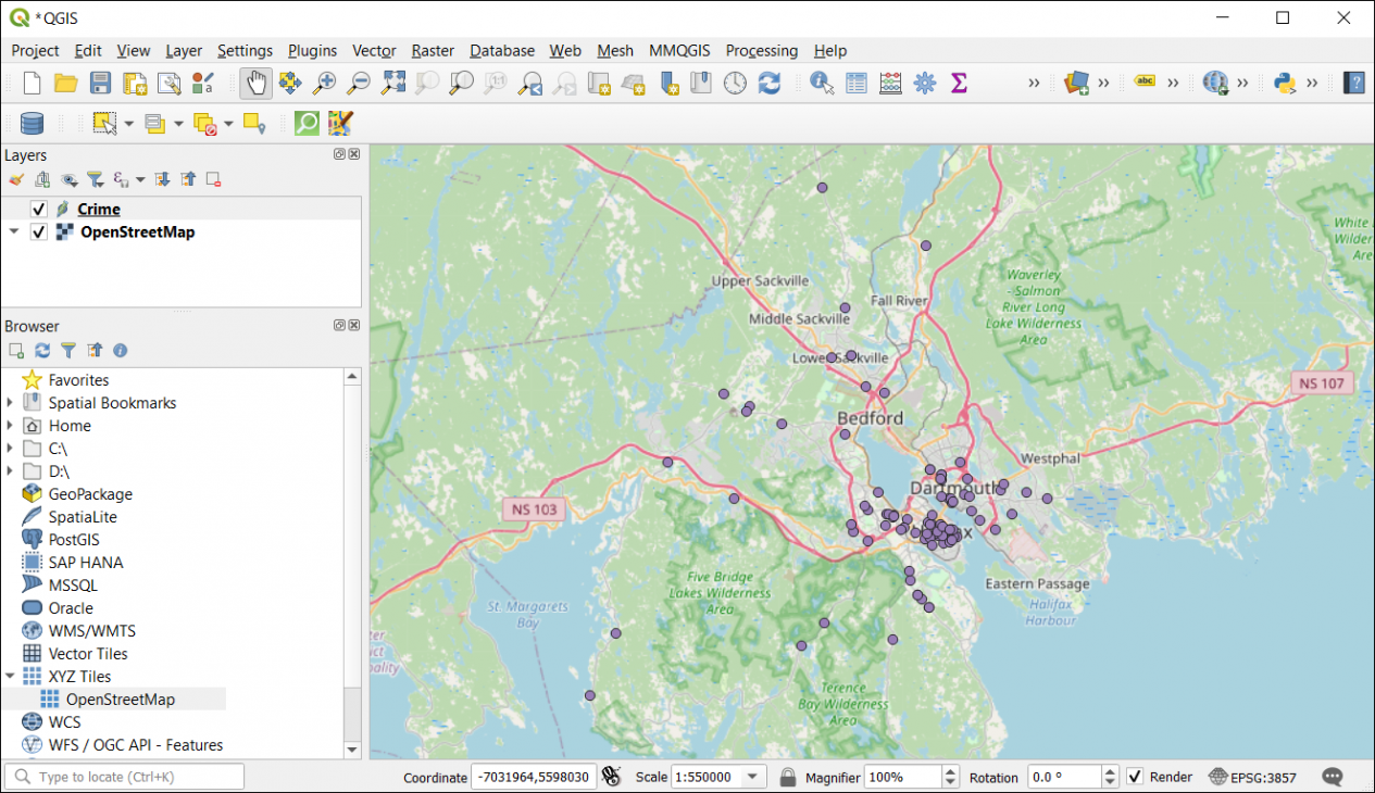
As such, the only input you require is a GIS layer that contains a set of points or polylines. Features can also contain an intensity value and be used to strengthen the degree of representation.
Symbology in Heat Maps
You don’t need to run any tools to create a heat map in QGIS. Instead, you can run it natively in the layer symbology.
Right-click on the layer that you want to create a heatmap for. Then, click the layer properties and go to the symbology tab.
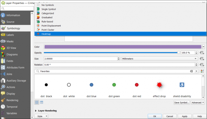
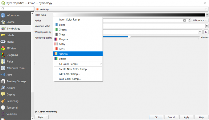
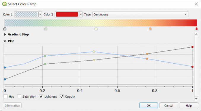
From here, you can go to the heat map option. You can select the color palette you’d like to use with any preferences.
For example, you can select any of the following color palettes – Blues, Greens, Greys, Magma, RdGy, Reds, Spectral, and Viridis. The traditional color palette for heat maps is the spectral one but the other ones can fit well in certain situations too.
Additionally, you have the option to set the transparency levels for different colors in the palette. This makes it easier to highlight hot or cold spots, but still, be able to view the basemap behind the heat map.
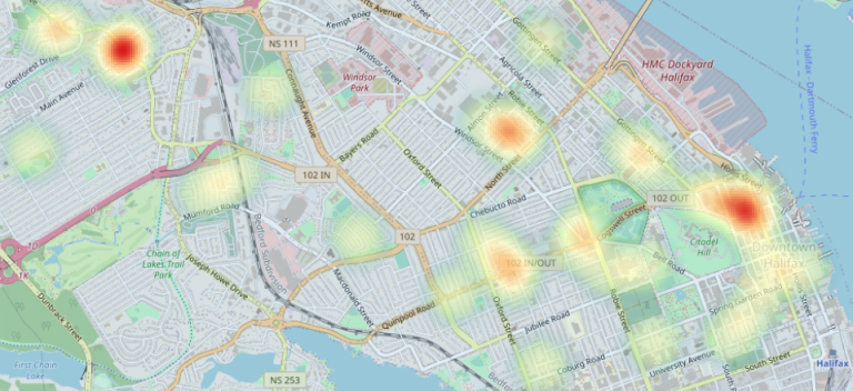
In this example, the cold spots are fully transparent. But anything from light green, yellow, orange, and red still has some transparency.
Once you complete all the QGIS heat map settings, you can finally view the results in the map canvas.
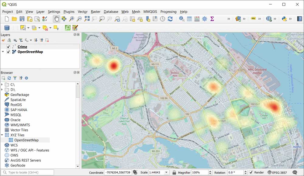
As you can see below, you are still able to see the OpenStreetMap basemap because of the transparency in the heat map.
QGIS Heat Maps
Heat maps are a type of map and are an effective way to visualize this phenomenon represented by different colors.
The levels of heat may represent different factors like population density, crime rates, or even pollution.
QGIS heat maps are extremely easy to use and you don’t need a tool to generate any type of results.
You also get the option to change color palettes or adjust the transparency based on different values in the heat map.