How to Track the Spread of Viruses Using GIS
Everyday, communities are at risk of transmissible diseases and growing pandemics like COVID-19. We use GIS to track the spread of viruses in real-time maps.
Everyday, communities are at risk of transmissible diseases and growing pandemics like COVID-19. We use GIS to track the spread of viruses in real-time maps.
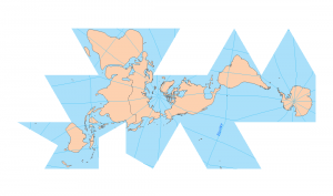
If you’re in need of a visual reference guide to map projection types, this goldmine of the top 50 global map projections used by cartographers will help.
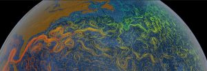
Our ocean’s movements push large amounts of water every day. But where? See this list of ocean currents map and visualize our oceans movement and dynamics.
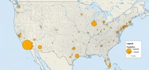
While graduated symbols and proportional symbols scale the size of the symbol based on value, dot distribution maps use dots for quantity.
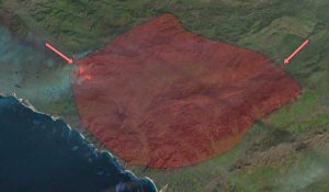
When wildfires burn, satellites (MODIS and VIIRS) track forest fires and deliver warnings to emergency crews. It all goes into real-time active fire maps.
The ultimate list of best maps online. These display state-of-the-art web mapping technology such as live feeds, 3D views and cutting edge visualization.
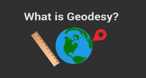
Geodesy is the field of applied mathematics that studies Earth’s shape, orientation, positions and gravity for the past, present and future.
There are several ways to help readers understand map scale and distance. For example, cartographers use scale bars, locator maps, stated and ratio scale.
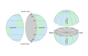
Latitude lines run east-west, are parallel and go from -90 to +90. Longitude lines run north-south, converge at the poles and are from -180 to +180.
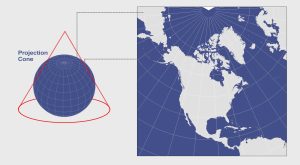
When you place a cone on the Earth and unwrap it, this results in a conic projection. Examples are Albers Equal Area Conic and the Lambert Conformal Conic.