10 Climate Change Maps – The Climate Explained
See the Effects of Climate Change
We hear it so much that we don’t really hear it. Climate change. But climate change is a real and serious issue.
The climate has changed throughout history. Most of these changes were caused because of variations in the Earth’s orbit.
97% of scientists agree that climate change is not caused by Earth’s orbit but by human activity.
Today, climate change is characterized by an abrupt increase in average temperature. rising sea levels, warming oceans and shrinking ice sheets add to the evidence.
But how much evidence can be seen on Earth? Today, we highlight some of the key evidence and potential outcomes of climate change.
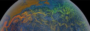
1. Google Planetary Earth Engine
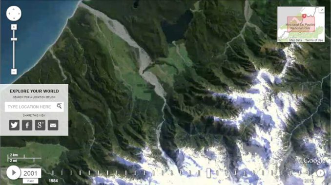
With a few clicks of the mouse, Google Earth Engine reveals startling transitions of our planet.
Using Landsat data, these climate change maps show how the desert city of Dubai has grown into the megacity today… in just 40 years.
Observe the rate at which glaciers like Alaska’s Columbia Glacier have melted… and are actually speeding up.
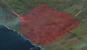
If an old tree falls in the forest and nobody’s around to hear it, does it make a sound? Rainforests in Brazil are vanishing at an accelerating rate. With timely satellite data from Landsat, everybody can hear it.
From the lakes of Las Vegas drying up as Sin City sprawls… to the disappearance of farming villages across the Yangtze River Delta in China… to the oil boom in Alberta and its environmental impact…
These climate change maps are breathtaking…
But are living proof of just how much humans impact their environment. See it in Landsat Explorer.
2. NASA’s Earth Climate Change Maps
Remote sensing satellites reveal a unique perspective of our planet. Sensors in orbit gain new perspectives taking advantage of the electromagnetic spectrum at its fullest.
Like clockwork, NASA’s Earth Climate Change Global Map carves out a view of what’s happening on our planet with a full set of climate change maps.
The atmosphere, the land, the water, the ice, and all living things – NASA keeps score of them all.
NASA tracks aerosols, snow cover, and sea surface temperature monthly so we can understand how our planet works relative to climate change.
Through the lens of satellite sensors like MODIS, AMSR-E, TRMM, and MOPITT – never in our history have we understood Earth’s climate as we do today.
READ MORE: The Big List of 50 Satellites
3. Surging Sea Level Analysis
How much will the sea level rise at our current pace?
The Surging Sea Map charts out two possible futures:
First, sea levels at the course we are on now. And secondly, sea levels with extreme carbon cuts. But this depends entirely on the total amount of carbon we put into the atmosphere.
When glaciers and ice caps melt, sea levels rise. These sea-level projects are based on that expansion.
Sea level projections are based on the expansion of ocean water as it warms; melting glaciers and ice caps, and the decay of Greenland and Antarctic ice sheets.
Carbon choices. Sea level choices. The future is yours to decide.
READ MORE: 5 Maps that Explain the Arctic
4. Disappearing Glaciers
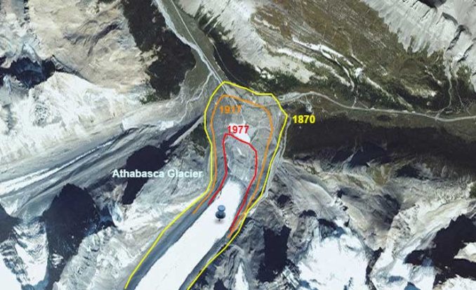
A grim consequence of climate change is retreating glaciers and the overall increase in sea levels.
The Disappearing Glaciers story map takes you on a journey highlighting the realities of climate change on glaciers on Earth.
From the Canadian Athabasca Glacier to the Upsala Glacier in Argentina – at one point these glaciers extended well beyond their current extent.
This map digitizes the global retreat of glaciers showing just how much glaciers have disappeared. Like the Storbreen Glacier in Norway, the glacier extent dates back to 1750.
This climate change map catalogs six retreating glaciers around the world and the irrefutable evidence of a warming world.
5. Esri’s Global Footprint Story Map
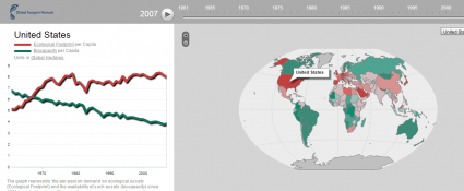
The Esri Global Footprint is a genius, timeline series map story designed by Global Footprint Network.
Which countries are ecological debtors?
The countries in red are ecological – which means that they rely on resource reserves from ecological creditors (in green).
What makes it so special is the charting interface.
In 1961, you can see how the vast majority of countries around the globe had ecological reserves.
…As you slide the cursor down the timeline, these resources have slowly dwindled as human activities consume more than 150 percent of Earth’s yearly biocapacity.
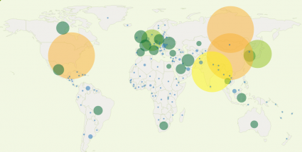
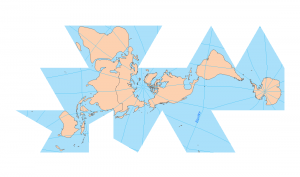
6. Carbon Emissions
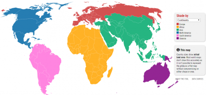
The Carbon Emissions map uses a cartogram-style technique to display data.
Each map is distorted to reflect a particular dataset – so high values bulge out, and low values contract.
For example:
Who are the people at risk due to climate change?
It’s scary to think of the number of people injured, left homeless, displaced, or requiring emergency assistance due to floods, droughts, or extreme temperatures in a typical year.
Climate change is expected to exacerbate many of these threats.
7. Climate Commons
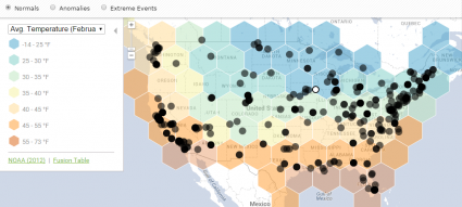
Despite the lack of updates, the Climate Commons is basically climate change news mapped.
Each climate news story is aggregated and relates to a geographic area. It’s all put together and represented in a hexagonal thematic map.
Users can explore the correlation between climate change data and its coverage in the media. You can filter by type of news story.
Climate change maps like this were interesting when it was alive and kicking.
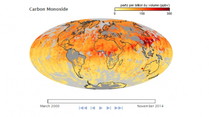
8. ElkanoData Pollution Map
Just how much have we polluted?
Siphoning data from the World Bank master database, ElkanoData puts together a cartographic masterpiece.
The ElkanoData pollution map sheds new light on carbon monoxide emissions over time.
The elephant in the room is the United Arab Emirates. At a whopping 24.98 metric tons per capita – this is more than double that of any European country’s CO2 rate.
While Africa and South America are the pollution angels of the bunch. These continents in general pollute the least per capita.
Pro Tip: Use the time slider to see how much countries pollute over time.
9. The Impact of a Four Degree Temperature Rise
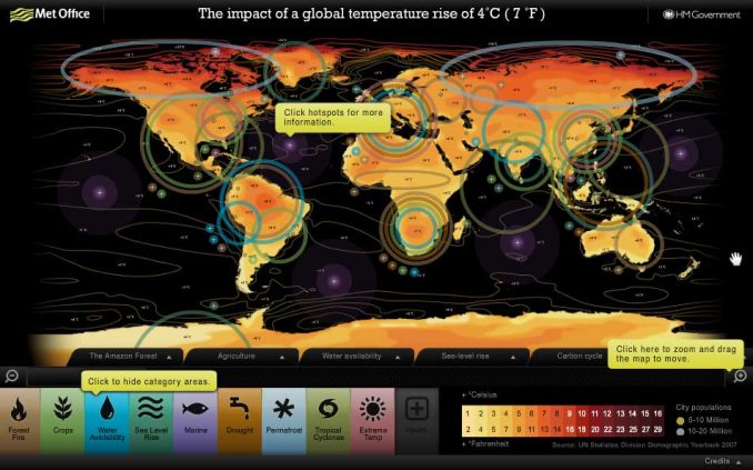
The Met Office Four Degree interactive map out all the effects of global warming.
Climate change maps like this exemplify the impacts of a four-degree temperature rise on our planet.
How are aquatic environments affected by global warming? Ocean acidification will be the destructor of fish habitat.
How do rising temperatures affect crop production?
Yields of cereal crops such as rice and maize could decrease up to 5% across Southeast Asia. These handy climate change maps take you on a geographic journey. It hits the bull’s eye because it paints a complete picture.
It provides concrete examples of how and where forest fires, agriculture, water availability, sea-level rise, marine life, drought mapping, and weather patterns will be transformed as a consequence of climate change.
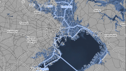
10. If All the Ice Melted
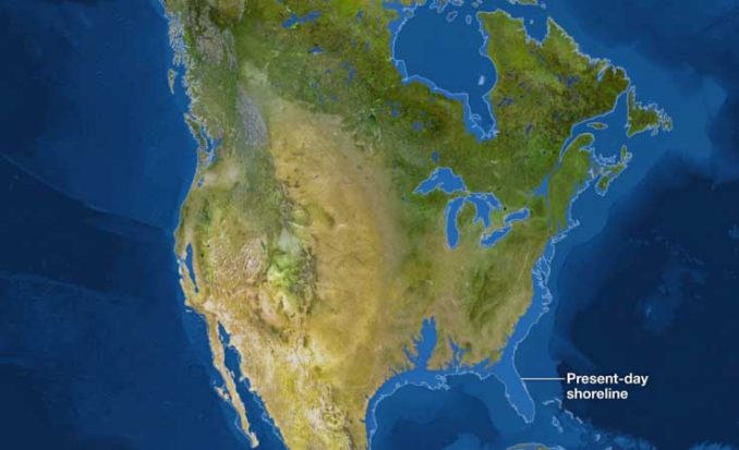
These National Geographic Sea Level maps show the world as it is now, with only one difference:
All the ice on land has melted and drained into the sea.
The world would look very different if five million cubic miles of ice melted on Earth.
Waters would consume most of Florida and California. Ocean-front properties would cease to exist. Inland cities like Denver and Minneapolis would be affected the least.
The picture isn’t so bright anywhere in the world if sea levels rose 216 feet.
The island of Japan would suffer substantially. A highly dense population with a relatively small landmass. The ramifications for Japan, a country with a coastline that is almost 30,000 km long would be huge – as many citizens would be forced to relocate.
Climate Change Maps Add Perspective
At a turtle’s pace, we shift over to environment-friendly green technologies.
Weather, sea-level rise, warming oceans, declining Arctic sea ice, and extreme events – are all tell-tale signs of global warming.
Today, you’ve seen how climate change maps like these give us a new perspective.
…and some of the effects are already taking place.
Our climate has immeasurable importance.
From crop production to changing weather patterns, grasping a clear understanding of our changing climate is the best investment we could ever make.
What are your thoughts on climate change?
Do you have any more visuals to add to our list of climate change maps?

The Global Footprint Network’s quiz is bunk to me. I get my worst score for living in a house that has been around for almost a hundred years rather than something that contributes to urban sprawl and development of once rural areas. I don’t think so. Plus, there are no questions about how many babies a person has pushed out to add to the overpopulation of the planet.
Show us proof of global warming, instead of words!
I cannot speak directly to which map you are referring because there are so many….but- Worst case scenario of complete melting of Antarctica and Greenland and all land ice could lead to 216 feet of sea level rise. This is entirely possible but might take a while. It is felt by many that our current models of sea level rise are vastly inadequate failing to account for several potentially catastrophic environmental feedback loops found in the natural emission of greenhouse gases nit just those released by human activity . Huge quantities of organic matter, CO2 and methane are currently thawing in previous layers of permafrost while methane hydrates wait under deep ocean waters for temperatures to rise enough to release them. Deep ocean water temperatures are reportedly rising faster than expected and Greenland is having yet another massive melt starting earlier than usual combined with less fresh snow from this past winter. So- 81 feet seems entirely within reach even if it’s 135 feet above current sea level. Or, it could just be a mistake. These rather dire possibilities are currently precicted after 2100 but there is reason for concern that they might be reached sooner when these feedback loops happen.
Some of the climate change inundation maps make no sense. For example the Columbia River upstream of the Bonneville Dam in the Pacific NW is protected by that dam. The water elevation difference across the dam is about 80 feet. How on earth could inundation upstream of the dam occur. Same for waters upstream of the Ballard Locks in Seattle. Lake Washington upstream is 60 feet higher and there is just no way sea changes could affect that.
I believe that us humans need to make a change and try to decrease what is happening before it is to late.