Data Engineering in ArcGIS Pro
What is data engineering in ArcGIS Pro?
The whole purpose of data engineering in ArcGIS Pro is for you to explore and prepare your data before you start using it for analysis or mapping.
In fact, data engineering is a critical step in the GIS workflow because it ensures your data is clean and ready to work with.
The 3 main processes you can achieve with data engineering are inspecting your data, gathering statistics, and cleaning your data.
In this article, we’ll cover all these capabilities of data engineering in ArcGIS Pro and how they can benefit you as a GIS analyst.
READ MORE: 20 ArcGIS Pro Tips and Tricks
Data Exploration
To start using data engineering in ArcGIS Pro, you can right-click the data layer in the table of contents and select “Data Engineering”.
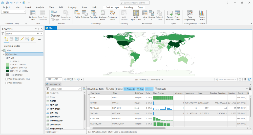
By enabling data engineering, the first thing you’ll see is all the fields in your table in the bottom panel.
For “text” fields, you’ll see ABC. Next, the “double” types of fields show 0.01. Finally, “integer” fields are simply 123.
When you hover over a field, you have the option to do any of the following –
- Update the symbology – Creates a color scheme for the field.
- Create a chart – Builds a histogram showing the distribution of data.
- Go to the attribute table – This takes you to the attribute table.
Here’s an example of updating symbology showing the level of GDP.
Statistical Analysis
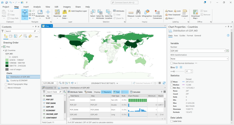
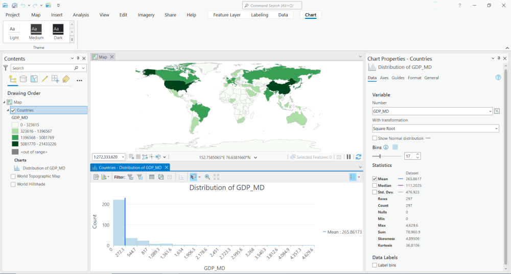
By using data engineering in ArcGIS Pro, it’s possible to create charts to understand your attribute data better.
I suggest you start by clicking the “Add All Fields and Calculate” button. This allows you to see all the fields in your dataset with a histogram chart.
You can also check out statistics like minimum, maximum, mean, standard deviation, median, count, and other statistics.
Charting and Graphing
You can also narrow down specific attributes by hovering over a field and clicking the “create chart” button.
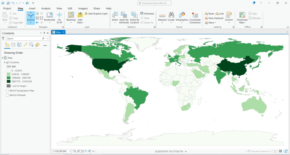
If you want to inspect the GDP, you can look at its histogram. It will place each country into bins based on lowest to highest GDP.
One of the best parts about data engineering is that you can interactively select different bins, and then it will highlight them on the map.
For example, if you select the highest bin, then it will highlight the United States of America on the map.
Data Cleaning
Data cleaning involves a range of tasks, such as transformation, integration, and enrichment, to ensure the data is accurate, complete, and usable.
The data cleaning tools are available on the top ribbon within the data engineering tools. Here’s an overview of the available tools for each grouping:
Clean
Construct
Integrate
Format
Conclusion
Traditionally, data engineering involves ETL tools and data pipelines.
But ArcGIS Pro gives you a set of geoprocessing tools to clean and prepare your data for mapping or analysis.
You also have options for data exploration, statistical analysis, and charting capabilities.
Overall, using data engineering tools in ArcGIS Pro can help you work more efficiently, improve the quality of your data, and gain insights into your data.