Data Visualization: A Skill For a Visual World
The Art of Insight
Data visualization. Why do we need it in the first place? Isn’t it enough to just look at rows and rows of data?
Picture a storybook with lots of colorful pictures. Data visualization turns complex data into easy-to-understand visuals.
Imagine flipping through the pages of that storybook. Intricate data transforms into comprehensible visuals through the power of data visualization.
Now, that’s something special. Today, we’re going to peer into the world of data visualization.
What is data visualization?
Data visualization helps us see patterns, trends, and insights in data. It’s like instead of reading all the words, data visualization translates the complexity of data into a compelling tale.
The beauty of data visualization lies in its ability to transform information into clear and engaging visuals. It’s rewarding because it makes a lasting impact.
And the sky’s the limit for all the types of visualizations.
Even though you have the ability to shape people’s perspectives, I still have a love/hate relationship for data visualization.
What I hate about data visualization
It’s providing that visual literacy is what I love about data visualization. Nothing is more satisfying than building that Picasso-esque visual for anyone to see.
Here’s the twist:
I love data visualization but hate data analysis. This is something you’re going to have to do in this career! If you’re working with something like Power BI, there’s more to it than just visualization. Here are some examples.
- Import data through Power Query or M. PowerBI also supports Python and R so these are options too.
- Perform analysis through PowerPivot and DAX.
- Build a dashboard with built-in charts. You may need to use a bit of JavaScript for customization.
See? It’s not just about data visuals.
What I’m saying is that you might have to dabble a bit in the “back end” work like transformation and analysis. Once you prepare your data, you’ll do all the “front end” work like visualization and design.
DAX can be a nightmare for anyone working in data visualization. That’s why most people choose to specialize in either analysis or design.
Data Visualization Examples
The fun is right here in data visualization. If you don’t like trying out different types of visualizations, then this career isn’t for you.
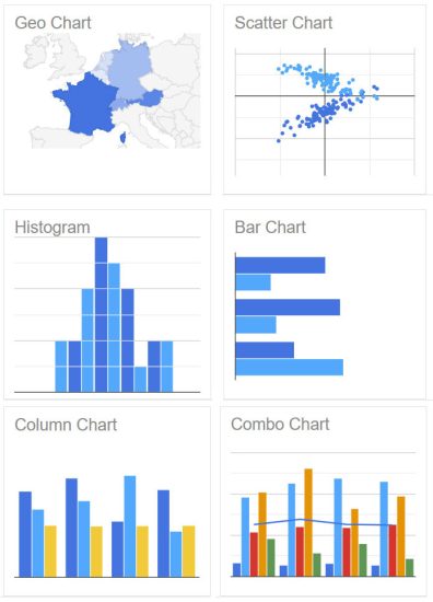
Here are some of the most common data visualization types:
- Graphs: Graphs use lines or bars to show values. Common variables are revenue, profit, and expenses.
- Tables: Tables organize information neatly in rows and columns. This can be as simple as an Excel spreadsheet.
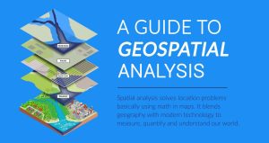
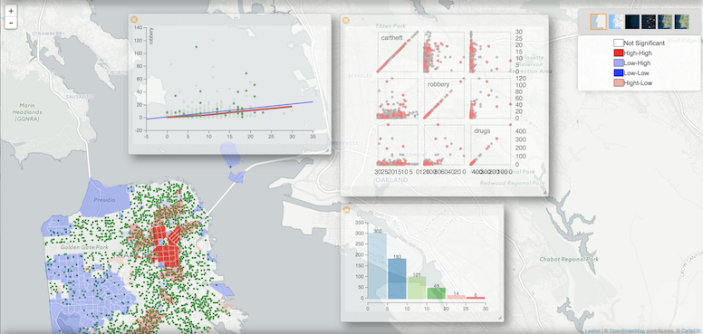
- Maps: Maps show where things are. The focus is on location. Geospatial data includes vector and raster data.
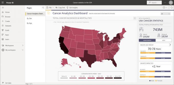
- Dashboards: A dashboard is an interface that displays key information. The purpose is to provide quick insights in an understandable layout.
- Charts: Charts help easily convey information and patterns such as pie charts, scatterplots, or bubble charts.
The Market Leaders in Data Visualization Software
According to Gartner, Tableau and PowerBI are the two major players. Here are some of the key differences between the two.
Tableau
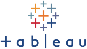
First, Tableau is well-established in the world of data visualization. It has a higher market share than PowerBi (but Microsoft is closing in).
One key advantage is its performance in handling larger datasets. Data connectivity, code-free capabilities, and visualization types are its other strong points.
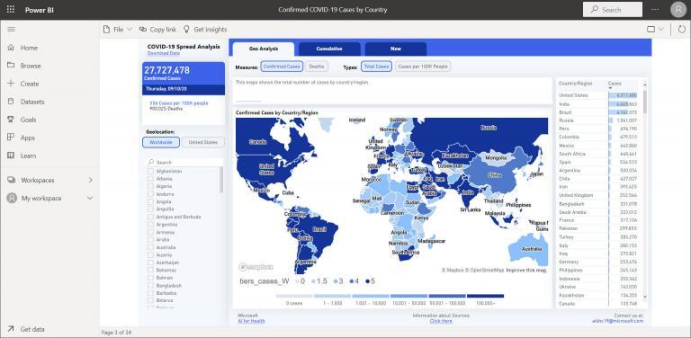
PowerBI (PBI)

If you are in a Microsoft Office 365 workspace, it’s a no-brainer to use PowerBI (PBI). I’m actually amazed at how much it has grown in popularity.
Power BI offers a lot of the same functionality as Tableau. But if you want a government job in the future, I recommend learning Microsoft PowerBI.
Other Types of Data Visualization
We’ve already shown you the top battle-tested data visualization techniques. Here are some of the not-so-common types of data visualization.
| Data Visualization Type | Symbols or icons are used to represent data points, conveying information through visual elements. |
| 1. Treemaps | Hierarchical representation of data using nested rectangles, where each branch of the tree is represented by a colored rectangle. |
| 2. Heatmap | Matrix of colors where each cell represents the value of a variable, showing patterns and trends. |
| 3. Venn Diagram | Illustrates the overlap between sets, typically using circles or ellipses. |
| 4. Sankey Diagram | Flow diagram that visualizes the flow of resources or information between entities. |
| 5. Radar Chart | A two-dimensional chart that displays multivariate data in the form of a spider web or radar. |
| 6. Bubble Chart | Similar to a scatter plot, but with an additional dimension represented by the size of the markers. |
| 7. Tree Diagram | Hierarchical diagram that represents a tree-like structure, often used to depict organizational hierarchies or relationships. |
| 8. Network Diagram | Graphical representation of a network structure, showing nodes and edges between them. |
| 9. Parallel Coordinates | Multidimensional visualization where each axis represents a different variable, and lines connect points across axes. |
| 10. Chord Diagram | Visualizes relationships between data points using arcs to connect them, often used for network analysis. |
| 11. Sunburst Chart | Radial space-filling chart that represents hierarchical data with nested rings. |
| 12. Glyphs | Symbols or icons are used to represent data points, conveying information through visual elements. |
| 13. Gauge Chart | A circular chart that displays a single value within a specified range. It’s often used for KPIs. |
Other Data Viz Software
As mentioned earlier, the two market leaders in data visualization software are Microsoft PowerBI and Table. I suggest you should be familiar with both.
Here are some of the less common software that we use for data visualization:
- Google Charts – For anyone who uses Google services, this is ideal for you. It’s perfect for displaying live data on your website. It’s also free and customizable, allowing you to build your own dashboards with it.
- Looker Studio (Previously Data Studio) – This one is good for building dashboards from external data sources. It has awesome data governance. Plus, its handy BI tool allows you to build your own BI logic.
- Qlik Sense (QS) – QS is especially fast for rendering visualizations (when filtering lots of data). But I’ve great complaints that it can be clunky like with QlikScripts.
- IBM Cognos – A lot of data scientists consider this software a dying tool. But it’s still worth mentioning as it’s still used in the data science community.
- Hex – This isn’t too popular of a data viz platform. Although it’s super efficient and flexible, be careful with its data security.
- SAP BusinessObjects Suite – SAP BO is a decent tool for data analytics and reporting. A lot of large and established organizations still use SAP BO even though it’s less popular than PBI and Tableau.
- ArcGIS Pro – This is the top mapping software in the industry today. Coupled with ArcGIS Online, you can create online mapping dashboards and applications to satisfy user’s geospatial needs.
There are more data visualization software options out there than ever before. Each one caters to the diverse needs across industries.
Use Cases in Data Visualization
Remember that in business, data visualization serves not only as a tool for insightful analysis but also as a powerful means to communicate complex information.
It’s all about idea illustration. The only limit is your imagination. Data visualization generates ideas and aids in data discovery.
But who are the power users for data visualization?
Industries such as finance, healthcare, marketing, and technology are mostly the power users of data visualization.
These sectors often deal with large and complex datasets. This means making visual representation crucial for analysis.
But also look at the government and the public sector for both internal and external-facing dashboards.
Building Your Story with Data Visualization
Data is the lifeblood of any modern business.
Through effective data visualization, organizations can not only harness the power of their information but also transform it into actionable insights.
This can pave the way for strategic growth and seize untapped opportunities.
Is your company using data visualization effectively? We’d love to hear from you in the comment section below.