How to Create Flow Maps with Directional Lines
Show the Movement of “Anything”
How would you show the movement of people, money, energy, or almost anything from one location to another? The best answer is using flow maps.
Flow maps denote the direction a phenomenon is being moved from one location to another.
Generally speaking, flow maps can be divided as radial, network, and distributive.
We’ve already explained how to create cartogram maps. Now, here are some insights on how to produce flow maps of your own.
1. Radial Flow Maps
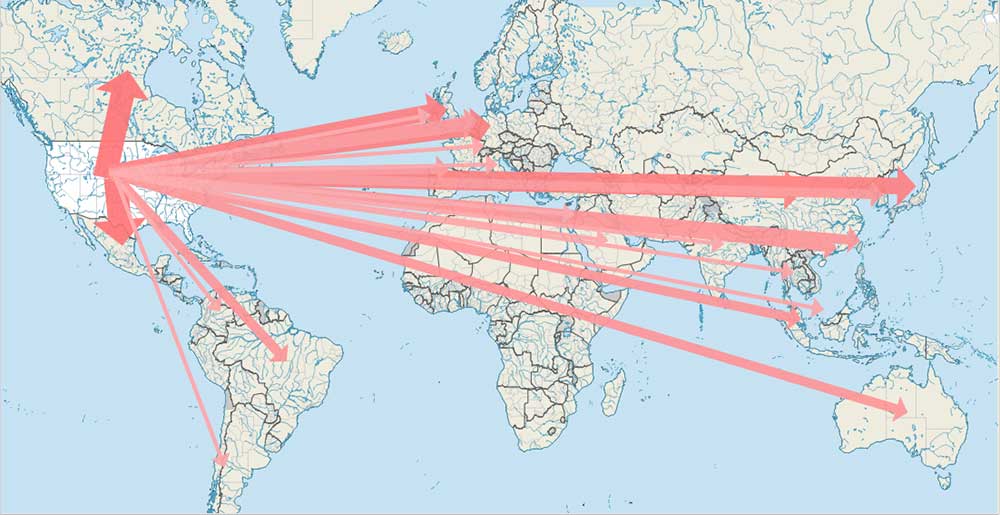
In radial flow maps, lines radiate from an origin node to a single or multiple destination nodes. Each hub links that movement of a phenomenon with a directional flow line, often in a radial pattern.
In this example, we use the United States foreign trade census data. Essentially, this displays what, where, and how much the United States exports to other countries.
The FlowMapper plugin for QGIS is a quick and easy way to generate flow maps of your own. When you download the plugin, it comes with test data that you can use as a template. But essentially, it boils down to these two text files as inputs:
- A list of nodes with their latitude and longitude coordinates
- A square matrix of magnitude values with each row corresponds to a ‘from’ node and each column corresponds to a ‘to’ node.
After running the plugin, the results look good. As you can see, line thickness depicts the magnitude of that movement. This means that the United States’ biggest trading partners are its neighbors in the north (Canada) and south (Mexico).
2. Distributive Flow Maps
Although similar to radial flow maps, distributive flow maps branch off to their destination. It’s not the necessary route that is being traveled. But it’s an abstract way how this commodity or information travels from an origin to multiple destinations.
For example, the English Coal Exports 1864 uses a distributive flow map. Coal exports disperse from their origin in England to multiple destinations almost like curled fingers.
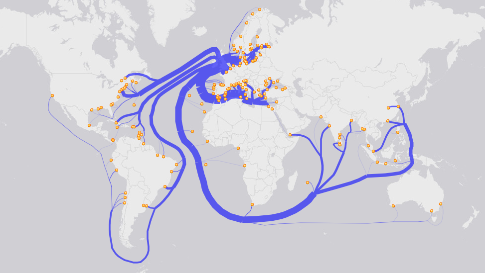
The tool you want to download to create this type of map is a customized Distributive Flow Lines tool (DFLT) in ArcGIS. Given an origin and multiple destinations, this tool uses cost distance and impedance to generate a distributive flow map for you.
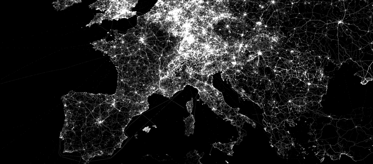
3. Network Flow Maps
Network flow maps show movement along an established network usually based on transportation or communication inter-connectivity. It uses the network information and attributes to delineate the amount of flow on the map.
For example, HERE maps show the average daily traffic in a given road network. These linkages can use line thickness and color for magnitude.
Another example is a network flow map that you see for airline companies. Heathrow Airport serves flights to 84 different countries in the world. With the focal point centered at Heathrow, 84 flow lines would radiate to each possible destination.
Mapping the Movement
To show the flow of goods, cartographers use lines. And to show the magnitude, they change the width of the lines.
Flow maps can be divided into radial, network, and distributive.
Along with his First Law of Geography, Waldo Tobler once said: “Geographical movement is critically important. This is because much change in the world is due to geographical movement. Movement of people, ideas, money, energy or material”.
And there’s no better way to denote this movement than with flow maps.


There is now a free online and very easy to use tool dedicated to flow mapping: https://www.flowmap.blue/