Cartogram Maps: Data Visualization with Exaggeration
What Is a Cartogram?
GIS typically focuses on drawing spatial features with accuracy. However, the cartogram does the opposite!
Cartogram types of maps distort reality to convey information. They resize and exaggerate any variable on an attribute value.
Pretty neat, don’t you think?
Previously, we crafted beautiful flow maps which show the movement of anything. This time, let’s design all the different styles of cartograms.
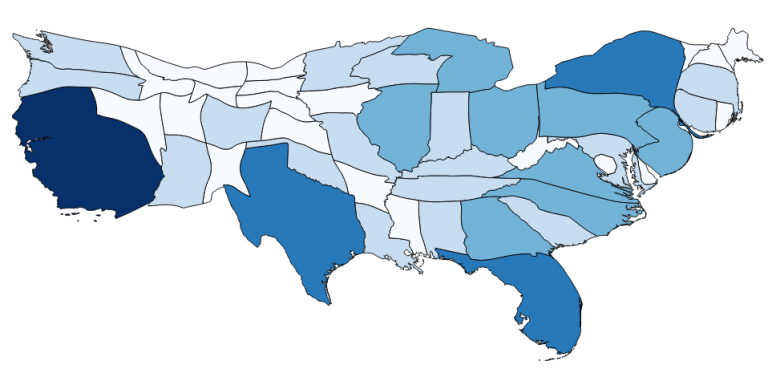
1. The Density-Equalizing Cartogram
Density-equalizing (contiguous) cartograms are your traditional cartograms. In density-equalizing cartograms, map features bulge out a specific variable. Even though it distorts each feature, it remains connected during its creation.
For example, this density-equalizing cartogram exaggerates the population for area. In QGIS, you can use the QGIS Cartogram Plugin for this style of cartogram.
As you can see, it’s easy to get information at only a glance. Which states stick out like a sore thumb in this population map? Instantly, you can see that a high proportion of the population lives in California and New York. While states like Montana and North Dakota are dwarfed to bite-size proportions.
As objects shrink and grow in density-equalizing cartograms, cartographers have to consider resizing polygons appropriately while maintaining their true geometry.
READ MORE: 35 Differences Between ArcGIS Pro and QGIS 3
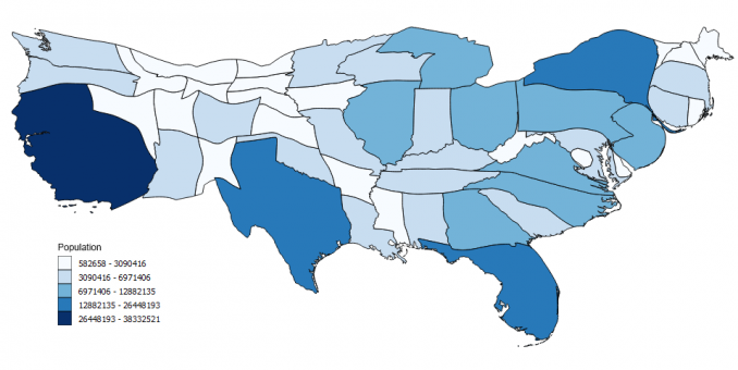
2. The Non-Contiguous Cartogram
Features in non-contiguous cartograms don’t have to stay connected. Objects can freely move from adjacent polygons and be resized appropriately. Because of this free movement, the shape remains intact for non-contiguous cartograms. For example, this map of the United States exaggerates the population.
Again, it distorts the geometry and features in the map to convey information about the population. For example, the state of California has grown significantly because of its large population.
The main difference between density-equalizing cartograms is that they move each feature’s centroid to avoid overlaps. Although overlaps sometimes exist in non-contiguous cartograms, it can be more difficult to differentiate between resized polygons.
READ MORE: 10 Free GIS Data Sources: Best Global Raster and Vector Datasets
3. The Dorling Cartogram
The Dorling Cartogram (named after Professor Danny Dorling) uses shapes like circles and rectangles to depict the area. These types of cartograms make it easy to recognize patterns. In the example below, we used GeoDa software to generate the Dorling cartogram.
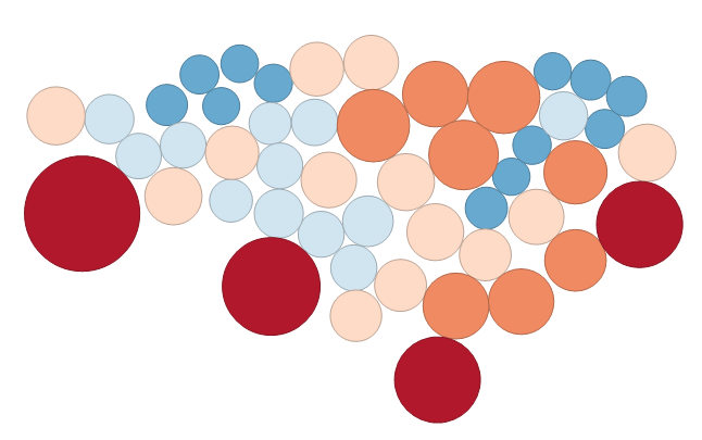
As you can see, states are substituted with appropriately sized circles to represent clusters of the population in the United States. Without a doubt, it is highly effective at conveying information and patterns.
However, the downfall of Dorling Cartograms is that it doesn’t maintain the centroid and shape. This means that readers may have difficulty understanding the features on the map. You may not have even known this was the United States if I didn’t tell you!
Do You Want To Create a Cartogram?
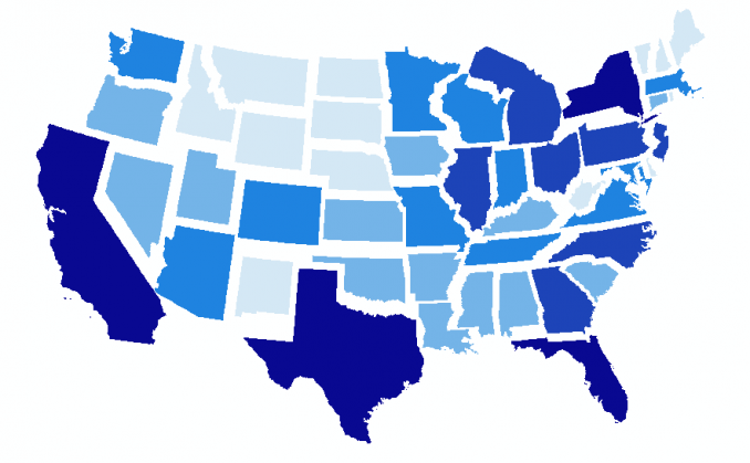
Cartograms exaggerate the size of the geography proportional to the statistic being shown. Specifically, the variable substitutes land area or distance.
But what they do is really distort our view of mapping by breaking the golden rule – sacrificing geometry to convey information.
Another key point is each type of cartogram has its pros and cons to effectively visualize data with the variable determining the size of the polygon.
To begin creating your own cartograms, give QGIS, GeoDa, and ArcGIS a test drive. Alternatively, read more on choropleth maps as another method of data visualization.


Would your team be able to do a Non-Contiguous Cartogram for the State of Maryland by county population? Would be a great visual for our commission as we consider future appointments. Thanks!