Operational Dashboards for ArcGIS
Operational Dashboards for ArcGIS
Operational dashboards are management tools for tracking, analyzing, and displaying key metrics to get insights into data.
They usually consist of the main map with several widgets, which are informal displays like charts, gauges, and graphs.
In general, operational dashboards are a single screen of metrics that you can see at a glance for decision-making.
Let’s get into operational dashboards for ArcGIS and why you should consider using them for your organization.
Static and real-time data
Data is the backbone of any operational dashboard, which drives the metrics for getting insights. There are generally two types of data:
STATIC DATA: This type of data can often be the base map of ancillary information with periodic updates.
REAL-TIME DATA: This type of data updates automatically in real-time like sensor, social media, and GPS location data.
Operational dashboards connect to data. But it displays or summarizes it in meaningful ways making it ideal for good “at a glance”.
Use cases for operational dashboards
There are several types of use cases for operational dashboards. But they usually have one thing in common and that is they are good for summarizing and evaluating performance.
Here are some of the most common ways to use operational dashboards:
- Asset management
- Situational awareness
- Emergency situation
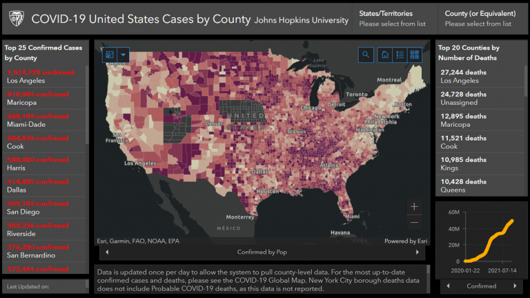
For example, the most famous operational dashboard is the COVID-19 tracker built by John Hopkins. Other than the cases and vaccination web maps as the centerpieces, it also contains widgets for total cases and weekly cases bar charts.
With over 4 billion daily views, Esri announced the COVID-19 tracker as the “Making a Difference Award” in 2020. The System Science and Engineering group at JHU published over a trillion maps collecting data from various sources.
No other COVID-19 visualization had such an impact on understanding the spread of the pandemic. That’s why virus mapping has become a key tool to prevent the spread of disease.
Summary: Operational Dashboards
Operational dashboards are available through ArcGIS Online (AGOL) through an organizational account. It’s also available for ArcGIS Enterprise through Portal.
Overall, operational dashboards are intuitive, interactive, and fully customizable without any experience needed in coding or GIS.
After you add you connect your data, you can build interactive infographics through widgets like bar charts, gauges, pie charts, and more.