Time in Maps: 10 Types of Temporal Maps

Some maps are timeless. While others, well, they have time in them. These temporal maps can be hard to display. So, that’s why we’ve created this list of 10 ways to show time in maps.
1. Static Timestamps
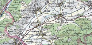
Static timestamp maps keep it basic. Each one includes a specific date or period. When you put them side-by-side, you can compare how they’re different.

For example, election maps can show you which party came to power. You can even see newly formed states. This type of temporal map is useful for showing change over time.
2. Time Sliders
Have an interactive map? Incorporate a time slider at the bottom or side of the map. This is common for viewing changes like urban growth, deforestation, or sea-level rise.

Users can adjust the time frame and select the time period they want. For instance, they can align specific periods based on their geographical extent.
3. Animated Maps
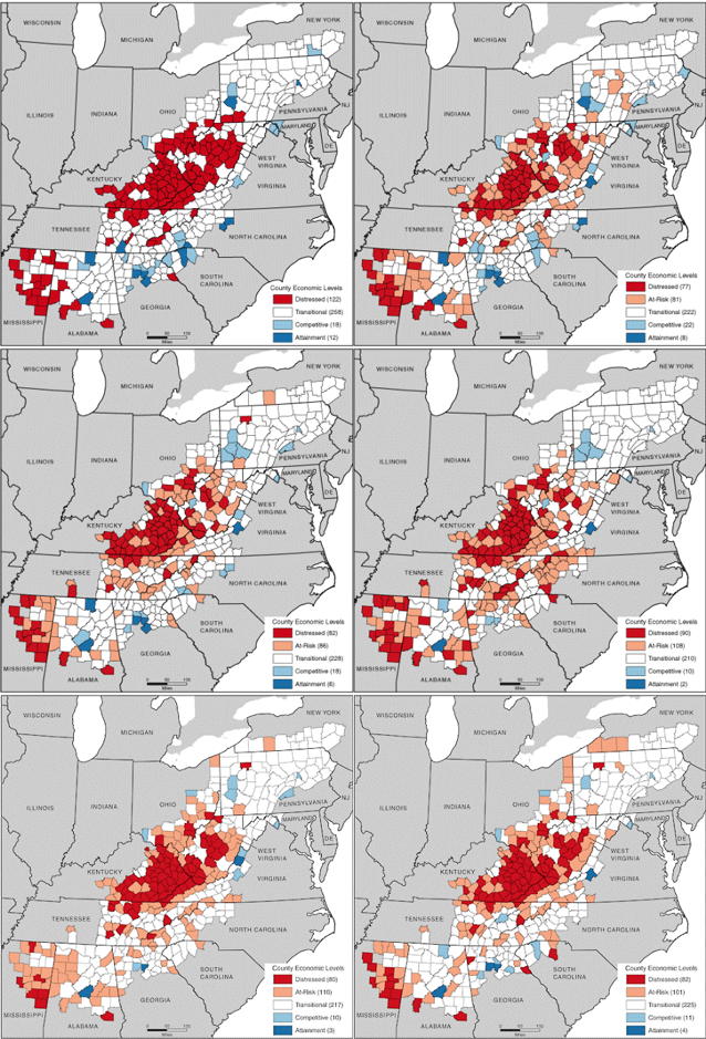
Maps that include animations show changes over time. It includes overlapping layers that can be toggled on and off. As such, you can compare different periods.
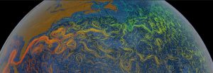
Time series animated maps are perfect for weather patterns moving. Other scenarios that use animated maps are the spread of an epidemic or historical territorial changes.
4. Flow Maps
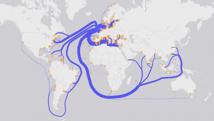
Flow maps show how things move over time. They use arrows or lines of varying thickness. Each shows the direction and volume of movement over time.
You’ll often see flow maps for migration patterns, trade routes, or traffic flow. They show where things start and end, adding the dimension of when.
5. Space-Time Cube Maps

Space-time cubes show data across both space and time within a 3D framework. We use them sparsely in GIS. But they’re ideal for showing patterns in geographical space.
In this model, the horizontal axes represent latitude and longitude, while the vertical axis corresponds to time. Each cube is a slice of time with a value associated with it.
6. Swipe and Spyglass Maps

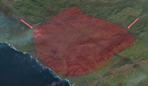
Imagine having two maps placed on top of each other. Using a “swipe”, you can slide back and forth to reveal different eras of time. It’s also helpful for before and after disasters.
On the other hand, magnifying glass maps allow you to hover a virtual spyglass over a map. As you hover over the map, you can compare time from two different eras.
7. Event Markers
Event markers are a basic concept to show time in maps. The idea behind it is that you simply place markers on a map. Each marker has labels with dates and descriptions.
I’ve seen event markers on maps for marking significant events. This is much more common in web maps because it allows users to explore events in a spatial context.
8. Time Spirals

It’s debatable if this is even a map. But this Geologic Time Spiral visual from the USGS is one of my favorite designs of all time. It’s unique because it shows all the geologic eras throughout history.
Unlike the other maps on this list, it’s been customized significantly. From the Paleozoic to the Cenozoic eras, each one displays its periods and how they stand out.
9. Temporal Charts
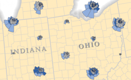
The idea behind this concept is to show a map and include temporal charts within the map. Both line graphs and Coxcomb charts are great for showing time.
Embedding temporal charts directly in your maps gives them geographic context. This approach allows for a direct visual correlation between the spatial data and its temporal changes.
10. Isochrone Maps

We use isochrone maps to show drive time within a specific time frame. Specifically, it displays how reachable areas are from a specific point.
Isochrone maps don’t have to only be drive-time. It can show areas by bicycle or even on foot within a given duration.
Time in Maps
Mapping time brings changes and patterns to life. With timestamps, swipes, and sliders, we see past and present side by side. While isochrone maps show drive-time, charts show time’s impact on space.
Do you have any questions about using time in maps? Or did we miss any of the important temporal maps in GIS? Please add to our comment section below.


