GeoDa Software – Data Exploration and Statistics at its Finest
It’s fun to explore your Geodata with Geoda. Universities like MIT, Chicago, and Arizona use GeoDa because of its powerful spatial data analysis, geo-visualization, and geostatistics tools.
So that’s what we did too. Here’s how to download GeoDa software from Spatial@UChicago. Now, let’s check out some of the key features of the new and improved GeoDa.
Pros/Cons of GeoDa
Here are some of the advantages and disadvantages of using GeoDa compared to other GIS software applications.
PROS
CONS
GeoDa Ratings
Mapping
Analysis
Editing
Data Support
Ranked #22 from 30 GIS Software
Getting Started with GeoDa
GeoDa has an intuitive interface that makes it easy for you to add multiple file formats like shapefile, GeoJSON, KML, SQLite, and table format (CSV, XLS, and DBF).
To see how your geographic data relates to space, GeoDa provides a variety of base maps from Carto and Nokia.
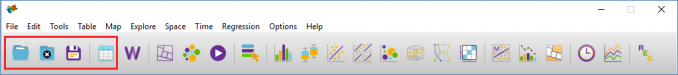
As shown below, these 4 tools are used to load data, save it as a GeoDa project (GDA), close the application, and open attribute data.
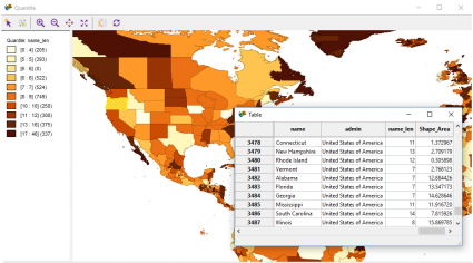
Similar to any GIS software, you can resize and move columns freely. You can join tables, query observations, and export data in different formats.
Not much more to say but how straightforward we found GeoDa to use. The interface is modern and you can get your hands dirty in your analysis quickly.
READ MORE: 10 Free GIS Data Sources: Best Global Raster and Vector Datasets
Geovisualization and Data Classification
This is one of GeoDa’s specialties – its geo-visualization tools. Anyone can gain insights from their data through the means of visualizations in the forms of thematic maps, cartograms, and map movies.

Really, you get more options than QGIS and ArcGIS in terms of data classification. The maps and rate drop-down give you an abundance of ways to classify your data.
- Themeless Map – A simple one-color map
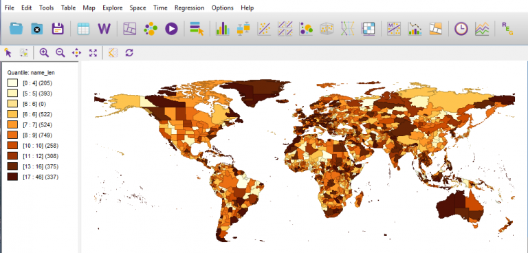
- Quantile Map – Arranges groups so they have the same quantity.
- Percentile Map – Shades data in different percentiles (<1%, 1-10%, 10-50%, 50-90%, 90-99%, >99%)
- Box Map – A quartile map where outliers are shaded differently.
- Standard Deviation Map – Each standard deviation becomes a class.
- Unique Values Map – Uniquely groups values into categories.
- Natural Breaks Map – Arranges each groupings so there is less variation in each class.
- Equal Intervals Map – Divides classes into equal groups.
- Rates-Calculated Map – Uses spatial weights to classify data.
READ MORE: Choropleth Maps – A Guide to Data Classification
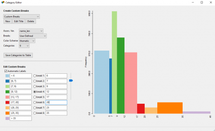
If you don’t want to use these types of data classification methods, then GeoDa has a Category Editor tool for you to interactively edit custom breaks in the data. The neat thing about is how it interactively generates a histogram as you change the dividing lines in your data.
The cartogram tool substitutes appropriately sized circles to represent a variable. For example, here we see clusters of the population in the United States.
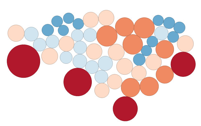
This is also known as Dorling Cartograms. However, the downfall of these types of cartograms is that the centroid and shape are not maintained. This means that readers may have difficulty understanding the features on the map. You may not have even known this represented the United States population if I didn’t tell you!
READ MORE: Cartogram Maps: Data Visualization with Exaggeration
Data Exploration Analysis
For this section, we’re going to hunt down some statistical relationships using the St Louis region county homicide counts and rates.
The three main variables we’ll examine are:
- HR8488 – homicide rate per 100,000
- PE87 – police expenditures per capita
- RDAC85 – resource deprivation/affluence composite variable (percent of families living below the poverty line, median family income)
READ MORE: University of Chicago Sample Data Sets (Great sample data)
Histogram
When you look at this histogram of police expenditures, you can see the distribution of how money was spent is relatively equal across counties.

But when you look at the histogram for homicide rates, it’s positively skewed.
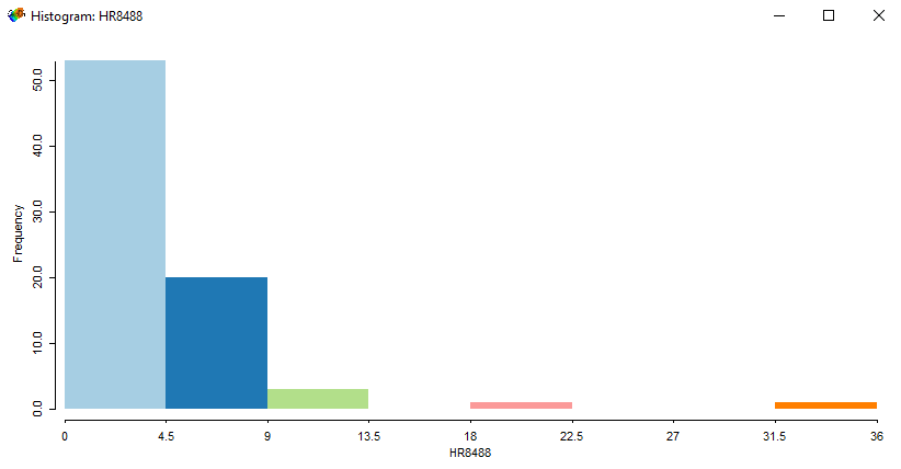
This means the majority of the data has a low homicide rate, but there are some counties with extremely high homicide rates.
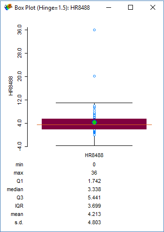
Box Plot
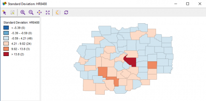
This box plot shows that the median number of homicides per 100,000 people is about 3.7. However, two counties really jump out with enormous homicide rates. Those two counties are St. Louis City (36.0) and St. Clair (20.2).
Just where are these two observations? In a standard deviations type of map, here we paint in red the two counties with greater than normal homicide rates. As you can see, they have a whopping 3 standard deviations greater than the mean for the homicide rate.
Scatter Plot
What’s the best way to see how variables relate to each other? For example, how does the resource deprivation/affluence composite variable relate to homicide rates?
Well, we can put each variable on the x-axis and y-axis of a graph and see how it all looks. This is called a scatter plot.
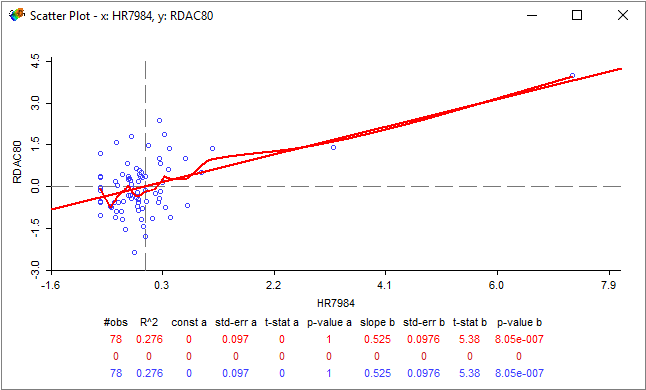
The linear regression curve (straight red line) gives us an r-square value of 0.276. The other red curved line is a LOWESS (LOcally WEighted Scatter-plot Smoother) that fits a smooth curve between these two variables.
So what does this actually mean?
It means that given these 78 observations, resource deprivation accounts for 27.6% of the variance for homicide rates. While a model with an r-square of zero indicates 0% that a model explains none of the variability of the response data around its mean… This really shows there is a partial relationship between these two variables (resource deprivation and homicide rates).
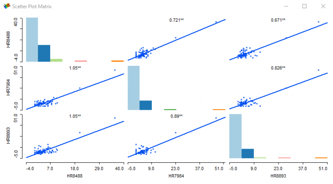
But it really doesn’t end here with GeoDa. If you want to see how a bunch of scatter plots relate to each other, pick all the variables your heart desires with the Scatter Plot Matrix.
3D Scatter Plot
You will have to really put on your thinking cap for Geoda’s 3D scatter plot. I did at least. What this tool does is graph out three separate variables in a three-dimensional space like this.

The nice thing about it is that you can project your data points to the XY-axis, XZ-axis, or ZY-axis. When you see how the data looks on each axis by rotating the 3D Scatter Plot. At this point, you’ll start to understand how data points become suspended in 3D space.
Bubble Charts
For bubble charts, you select the X and Y-axis variables. Further to this, you choose a variable for bubble size and color. What this enables you to do is cleverly visualize four variables.
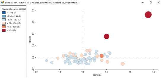
Be careful with the size variable as this can really influence your graph. You can right-click the graph and resize the bubble size from small to large. We keep it simple here and use the homicide rates as size. As expected, the two large red bubbles are St. Louis City and St. Clair.
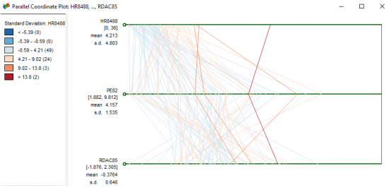
Parallel Coordinate Plot (PCP)
Meet my new favorite graph.
In a Parallel Coordinate Plot, each line corresponds to a county with homicide rates, police expenditures and resource deprivation plotted. Each of the dimensions corresponds to a horizontal axis and each data element is displayed as a series of connected points along the dimensions/axes.
The two red lines on the far right are the counties (St. Louis City and St. Clair) with the greatest homicide rates. The one red line snug at the right of the PCP represents St. Louis City. Not only does the county of St. Louis City has the highest homicide rate, but police are spending the most money and it has the highest resource deprivation. This graph really puts these three variables into perspective.
All in all, I am completely blown away by the data exploration tools in GeoDa.
Let’s see how it does with more geostatistical-based tools.
Finding Patterns in Geographic Space
The main difference in this menu is how these types of analyses are performed in geographic space. While histograms, scatter plots, and bubble charts simply analyze data, these next few tools understand how counties and attributes are related to each other in terms of their geography.
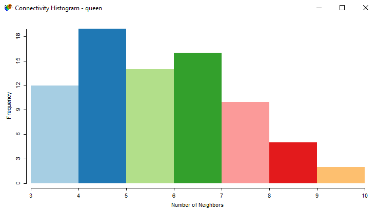
And it all begins with setting contiguity in the weights manager. I set the bordering to be in direct contact with one another with either a queen or rook contiguity. This influences the number of neighbors that connect to each county.
Here’s a histogram showing the queen connectivity and the number of neighbors:
Here’s a histogram showing the rook connectivity and the number of neighbors:

So similar, but different. Geoda offers a map for you to see how the rook and queen connect with their neighbors.
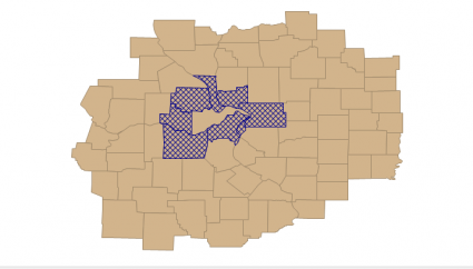
Love this feature.
Moran Scatter Plot
Because we’ve set how counties relate to each other, the Moran scatterplot will factor this in.
Positive spatial autocorrelation occurs when Moran’s I is close to +1. This means values are clustered together. While negative spatial autocorrelation occurs when Moran’s I is near -1. A checkerboard is an example where Moran’s I is -1 because dissimilar values are next to each other.
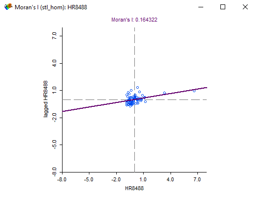
A value of 0 for Moran’s I typically indicates no autocorrelation. In this case, Moran’s I is 0.16 meaning that homicide rates are not so much clustered together.
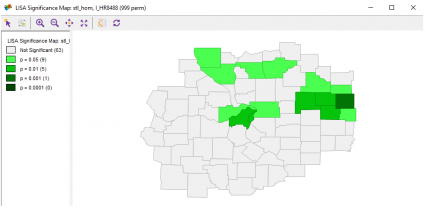
Spatial Autocorrelation
When you select a LISA Cluster map, it will generate a choropleth map showing a significant Local Moran statistic. Bright red suggests clustering of high similar values. Blue counties show low-low values suggesting clustering of low values together.
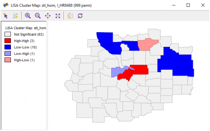
The remaining grey shades indicate no significant relationship. While high-low and low-high locations indicate spatial outliers.
Lastly, GeoDa produces four significance levels – p < 0.05, p < 0.01, p < 0.001, p < 0.0001.
GeoDa can produce univariate, differential, and local Moran’s I with EB Rate as well.
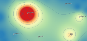
Local G Cluster Map
The last tool is a variation to see how data is clustered. In the center of St. Louis, high rates of homicide are centralized in the middle. While, in the north-eastern portion, homicide rates are much lower.
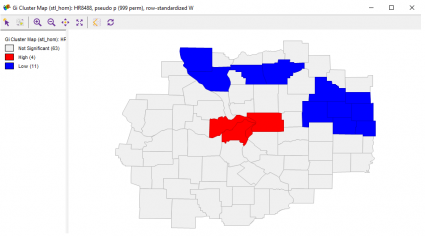
Imagine how useful this is for the real estate industry and those wanting to move to St. Louis. In this case, the G*Clusters map generates the same results.
Spatial Regression
If you have homicide rates in a city, you can use spatial regression to understand the factors behind patterns of crime. Why are there homicide rates concentrated in the center of St. Louis? Is it police spending? Can resource deprivation explain homicide locations?
Here is some terminology commonly used in regression models.
- Dependent variable (Y): What are you trying to predict. (Location of homicide rates)
- Independent variable (X): Explanatory variables that explain the dependent variable. (Income, education, etc)
- Beta-coefficient: Weights reflecting the relationship between the explanatory and dependent variable.
- Residual: The value not explained by the model
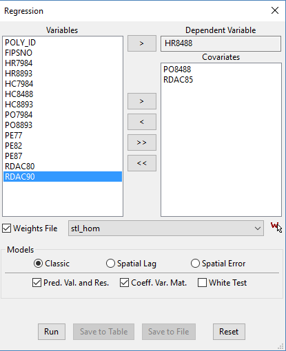
In our simple model, homicide rates are the dependent variable. While we try to explain high and low homicide rates with police expenditures and resource deprivation.
Regression Report
Our output table is as follows:
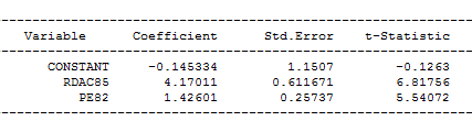
When you substitute each coefficient in our regression model, it means that areas with higher resource deprivation and higher police expenditures would mathematically generate homicide rates. The standard error of the estimate is a measure of the accuracy of predictions. In a regression line, the smaller the standard error of the estimate is, the more accurate the predictions are. While the t-statistic is the coefficient divided by its standard error.
Another statistic to keep in mind is the Jarque-Bera statistic which indicates whether or not the residuals (the observed dependent variable values minus the predicted values) are normally distributed. When you put these residuals in a histogram, the null hypothesis is that they should resemble a bell curve.
Further to this, the output table also lets you test for multi-collinearity when two or more predictor variables in a multiple regression model are highly correlated. The calculated Moran’s I determines whether the regression residuals are spatially random (spatially autocorrelated).
Other options in GeoDa are the maximum likelihood estimation for spatial lag models and spatial error models.
READ MORE: Spatial Autocorrelation and Moran’s I in GIS
GeoDa Final Thoughts
You’ll have a lot of aha moments in GeoDa walking through some of their sample data. Not only does it serve as a gentle introduction to spatial analysis and statistics for non-GIS users, but it’s also useful for those users who are trying to learn statistics.
Luc Anselin started GeoDa as an ArcView 3.0 extension. Due to its popularity, it’s been reworked into its own open-source, data exploration tool.
While not necessarily your prototype full-blown GIS package, GeoDa possesses a range of exciting analytical and geo-visualization tools for industries such as economics, health, real estate, and more.
Have you tried putting your geostatistics to the test with GeoDa? Let us know what you think of it in our comments section below.


QGIS plugin?
Not that I know of
Can GeoDa help me calculate an area of green surface in hole city automaticly?
Need software to manage a cemetery. Simply unsold graves green; sold but unoccupied yellow and occupied red. Ability needed to “click” on grave and have table of data such as deceased occupant; date of interment, etc. I have knowledge of AutoCAD and cemetery is mapped in that format.
Generally, the GIS software options are between commercial and open source. For commercial, Esri ArcGIS is what companies and universities use the most. If you want to go with open source software (which has tons of great functionality and can do 90% of what commercial software does) – you should choose QGIS.
This sounds like a basic data management and visualization you’re looking for. Not sure if you’re looking for the capability to produce webmaps? ArcGIS Online does give you the option to create free account with a limited number of features so this could be an option for you too. It’s very intuitive and easy to get started.
Both QGIS and ArcGIS allow you to convert AutoCAD to a native GIS format.
If you’re looking to explore statistics, then GeoDa is one the best. It’s an exploratory tool. But for data management and maintenance, perhaps you may want to look at QGIS or ArcGIS.