Semi-Variogram: Nugget, Range and Sill
Tobler’s First Law of Geography states that “everything is related to everything else, but near things are more related than distant things.”
In the case of a semi-variogram, closer things are more predictable and have less variability. While distant things are less predictable and are less related.
For example, the terrain one meter ahead of you is more likely to be similar than 100 meters away.
As you’ll learn, a semi-variogram charts out this critically important concept of how sample values (pollution, elevation, noise, etc.) vary with distance. Also, we’ll show you how this relates to kriging interpolation.
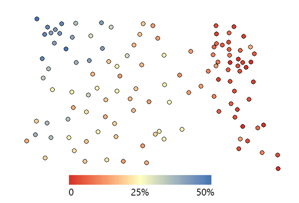
Soil Moisture Samples
Our example contains 73 soil moisture samples in a 10-acre field. In the northwest corner, the samples are much wetter with higher water content. But in the eastern quadrant, they are much dryer as color-coded in the image below.
- How predictable are values from place to place?
- Are known values closer together more similar than values farther apart?
We can describe this idea with statistical dependence or autocorrelation. Further to this, spatial autocorrelation (things closer together are more similar than things farther apart) provides valuable information for prediction.
How Semi-variograms Work
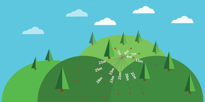
To understand spatial dependence, you can estimate it with a semi-variogram. Semi-variograms take 2 sample locations and call the distance between both points h.
On the x-axis, it plots distance (h) in lags, which are just grouped distances. Taking each set of 2 sample locations, it measures the variance between the response variable (water content in soil) and plots it out on the y-axis.
Depending on the observer, semi-variograms look like a big mess of points. For example, our soil moisture plot looks like this:

But you can really do some detective work by selecting individual points. When you take this single point on the semi-variogram:
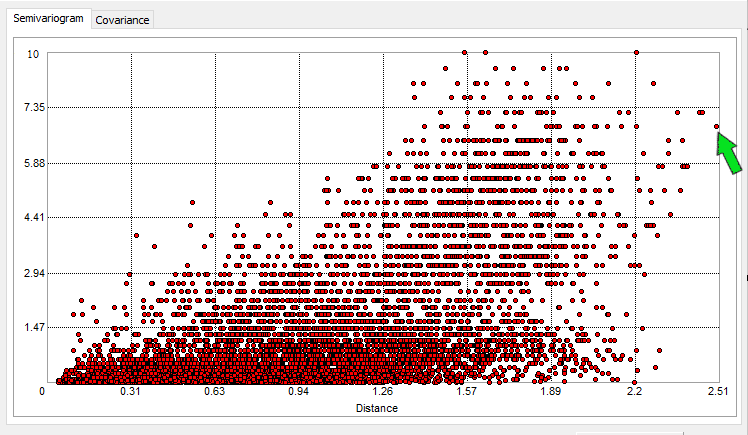
You can see which 2 points they represent on the map. This makes sense because they are a far distance apart from each other. Hence, its far-right position in the semi-variogram. It’s actually this point that we are highlighting below:

They also have a large difference from the mean value in that particular lag distance. It’s positioned higher on the y-axis if the semivariance is high. As you probably noticed, the semivariance is smaller at closer distances and increases with larger lag distances.
Always remember:
We are looking at all distances between 2 samples and their variability. A semi-variogram considers all points and their distance with variance.
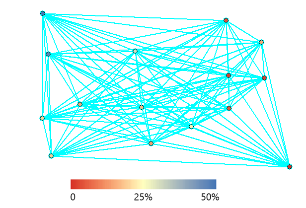
That’s why semi-variograms have so many points on them. Here’s a subset of the data set above to see all the different sets of points that we can plot out in a semi-variogram.
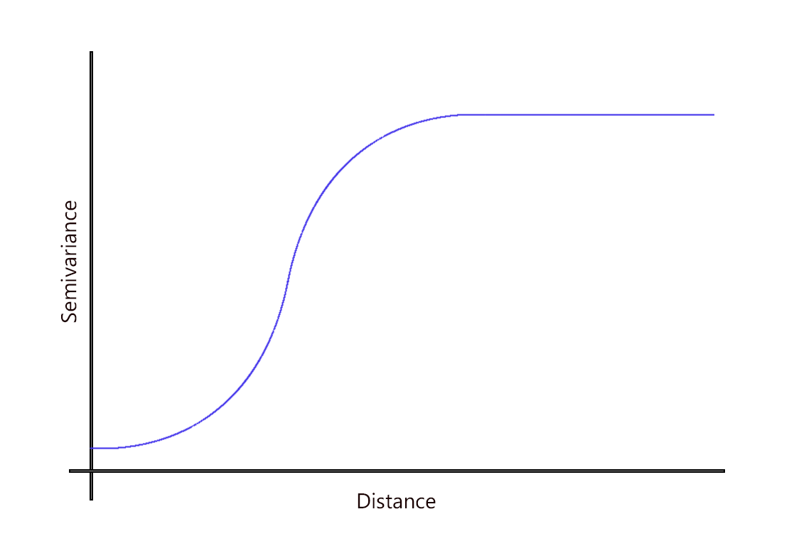
What are the range, sill, and nugget in semi-variograms?
At sample points with close distances, the difference in values between points tends to be small. In other words, the semi-variance is small.
But when sample point distances are farther away, they are less likely to be similar. This means that the semi-variance becomes large.
As the distance increases away from sample points, there is no longer a relationship between the sample points. Their variance begins to flatten out, and sample values are not related to one another.
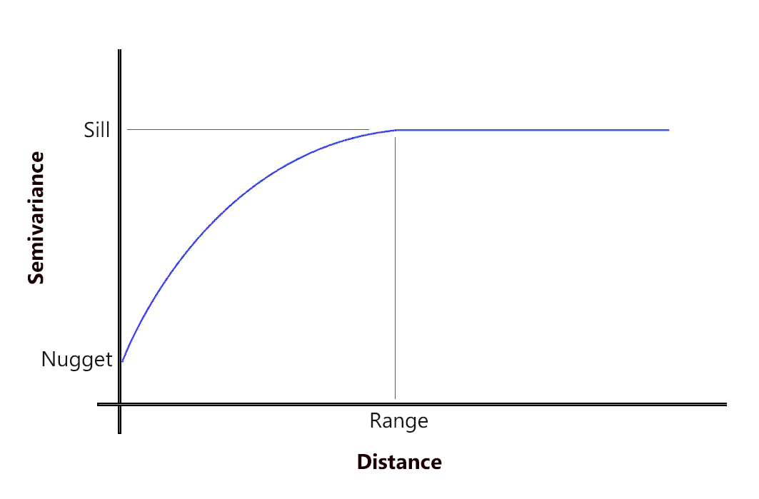
SILL: The value at which the model first flattens out.
RANGE: The distance at which the model first flattens out.
NUGGET: The value at which the semi-variogram (almost) intercepts the y-value.
When you have two sample points at the same location, you can expect to have the same value so the nugget should be zero. Sometimes they don’t and this adds randomness. But before the graph starts leveling, these values are spatially autocorrelated.
As expected, when distance increases, the semivariance increases. There are fewer pairs of points separated by far distances, hence the less correlation between sample points.
But as indicated in the semi-variogram with the sill and range, it begins to reach its flat, asymptotic level. This is when you try to fit a function to model this behavior.
Mathematical function and models
You select the type of model for how it fits the data because it will provide a mathematical function to the relationship between values and distances. We use functions that are the best fit like exponential, linear, spherical, and Gaussian.
Ideally, you are trying to lower your R-squared value, as best fit as possible. However, when you have an understanding of how the phenomena behave with distance, you can better choose which model to use.
For example, here are the mathematical functions you can apply to semi-variograms:
1. Linear Models
A linear model means that spatial variability increases linearly with distance.

It’s the most simple type of model without a plateau, meaning that the user has to arbitrarily select the sill and range.
2. Spherical Models
The spherical model is one of the most common models we use in variogram modeling.
It is a modified quadratic equation where spatial dependence flattens out as the sill and range.
3. Exponential Models
The exponential model resembles the spherical model in that spatial variability reaches the sill gradually.

The relationship between two sample points decays gradually, while at a distance of infinite spatial dependence dissipates.
4. Gaussian Models
The Gaussian function uses a normal probability distribution curve.
This type of model is useful where phenomena are similar at short distances because of its progressive rise up the y-axis.
5. Circular Models
This type of prediction model uses a circular function to fit spatial variability in a semi-variogram.

It resembles the spherical model function where spatial dependence fades away at its asymptotic level.
What is a Semi-Variogram?
Semi-variograms provide a useful preliminary step in understanding the nature of data.
Each phenomenon has its own semi-variogram and its own mathematical function. The user uncovers the relationship between values and distances and then chooses the best-fitting model.
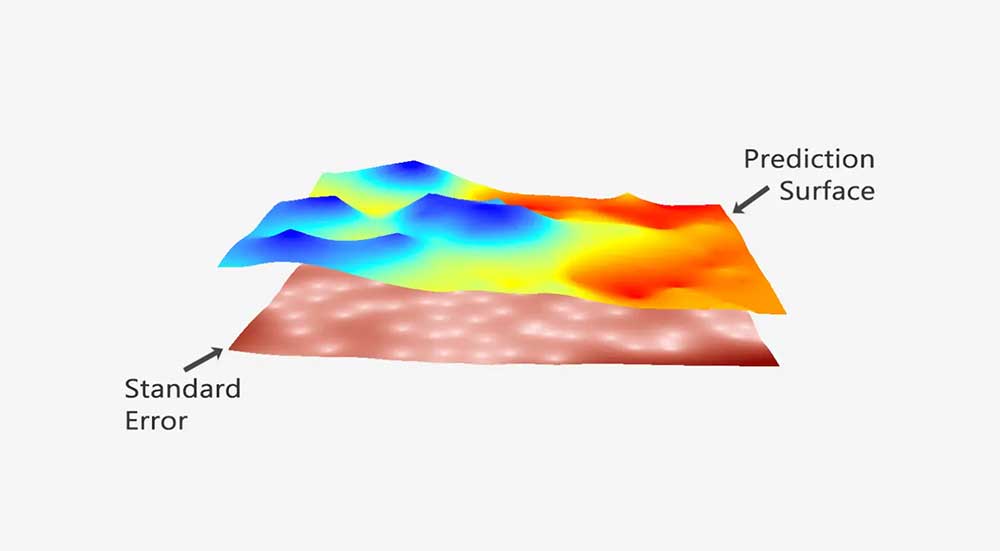
Although semi-variograms are handy for understanding variation with distance, the model you choose from semi-variograms commonly goes into kriging. Because this type of interpolation technique uses the mathematical model from the semi-variogram, it’s one of the best forms of prediction today.
This is because the variogram model influences the prediction of those unknown values during kriging interpolation.


Quoting Davi’s comment there, the R-squared value in the curve fitting task should seek maximization, not “lowering”.
Thanks for the explanation. It has given me great insight
Thanks for the information
I found it revigorating.
Thanks for the information. It really helps me understand geospatial analysis for my agriculture research
Good read however, when you have repeated samples (say) from the same field displaced in time or following (say) animal grazing we observe nugget variance spreading out. This is either due to changing local environment over time or animal treading effects .e.g. soil compaction. more details 0n this feature will help your Readers…
Thanks for the information it really helps me understand the concepts of sill, nugget and range.
Shouldn’t be trying to higher your R-squared values in “Ideally, you are trying to lower your R-squared value, as best fit as possible.”?
Thank you for this very didactic text.