33 Map Elements to Include in Cartographic Design
What to include in your maps
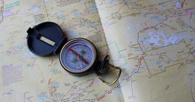
This guide is like your compass – these 33 map elements will guide you in the right direction and show you how to create stunning maps.
It’s time to create remarkable maps that make you an instant expert, attract positive feedback, and flood your portfolio with solid cartographic design output.
There’s no silver bullet for map design. It takes time and effort to create high-quality cartographic maps. Often, it entirely depends on user needs.
But there are almost always reoccurring elements in map-making. That’s why we’ve put together this mapping checklist. Take a look:
1. Map Has a Clear Purpose
What is the map’s intention? Are you achieving it? Designing the concept of a map is typically how cartographers begin. Ideas are driven by purpose.
Maps help people understand their place on Earth. Whether you’re mapping geology, census data, or watersheds, your map’s purpose helps readers spatially understand a theme or subject.
2. Map Title Reflect the Author’s Intention
The map title should reflect the purpose of the map. The title is usually based on the information being displayed on your map. It usually includes your theme and geographic location.
Your title shouldn’t leave your readers guessing its purpose. The map title reveals important information to the reader. It’s the intention worded to the map content.
3. Use the Appropriate Template
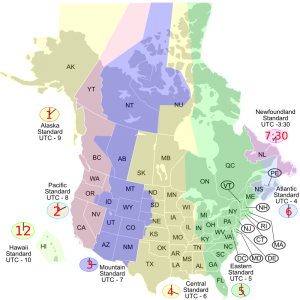
Some companies and organizations have map templates on hand. Throw in the data. Change a couple of map elements. With a few clicks of the mouse, there you have it! Mapmaking is made easy.
When selecting the template, keep the map orientation in mind. There is landscape or portrait orientation and different map sizes. If map features are linear and run east-west (like pipelines or highways) use a horizontal map layout.
4. Add Company and Client Logo
Chances are your map will be designed for someone. Adding your organization and the client’s logo on the map is a way to recognize the author and who the map product was designed for.
Did the client (if there is one) ask to have its logo on the map? Are you using the newest one? When in doubt, seek permission to use somebody else logos or name.
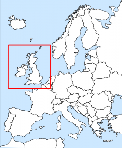
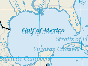
5. Ensure Correct Map Extent and Coverage
Maps help us view the world in a scaled-down fashion. But how scaled-down should your map be? Understanding the scale of your map is one of the first steps in map design.
Is your data the scale of a continent or an airport? Large and small-scale maps are expressed in ratios. They’re usually rounded such as 1:100. Pan to the center so your main feature is front-and-center. Alternatively, you should ensure other important features are included as a reference. The map-making process must always consider the extent and coverage.
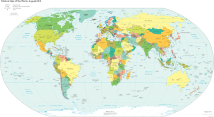
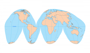
6. Define a Projection
The Earth is curved. Map projections flatten our curved Earth and always add distortion. They transform the sphere into a plane. Cartographers display maps in two dimensions.
Whether you want to preserve area, direction, or scale, choosing your map projection is not always an easy task. After defining your projection, list the projection in your map’s metadata.
7. Display the Correct Content
You cringe at the thought of using incorrect data in your maps. GIS technicians revise data until it’s deemed final. In the end, you have to ask yourself – am I linking to the correct file?
Maps are abstract representations of Earth. But the correctness relies on the accuracy of the data that’s being represented. Do the extra detective work to ensure the correct data is being shown.
8. Give Perspective with an Inset Map
It’s one of the essential map elements. A well-designed map often includes a key map. A key map puts your geography into perspective on a smaller scale. It’s a smaller, separate map that shows the extent of the map concerning a larger area.
But they’re also used to clarify features on a map. Inset maps can focus on areas of interest. They enlarge features in smaller maps giving readers more perspective.
9. Key Map – A Map Within a Map, Within a Map
A map within a map, within a map. Confused yet? These types of maps are tremendous assets for mammoth-sized projects. It gives even more perspective to the reader and communicates ideas even more effectively.
During the construction of a new pipeline spanning an entire continent, the main map may show a water crossing. The inset map may show the state or county. Another map at an even smaller scale (zoomed out) can show all the water crossings in the United States.
10. Decide Your Labeling/Annotation
Turn nothing into something. Map labels need to be placed with purpose. But busy maps with too much labeling are confusing with no better place than a trash bin.
The general rule is that labels go left-right and south-north. Font face, color, and size need to be considered. Labels can follow the curvature in features. They shouldn’t overlap lines because they become unreadable. It’s good practice to offset preferably on top. Annotation font size can be scaled larger for more important features.
11. Glue Readers in with Neat Lines

Neat lines are good at keeping readers glued to your maps. Reader’s eyeballs become locked in because neat lines wrap all your content with one solid border.
There’s not always a dire need for neat lines. But a lot of the best map makers use neat lines because the surrounding border just belongs on a map as a container.
12. Order Layers by Importance
Data layers need to be ordered properly for map-making. The correct hierarchy of layers in a map determines whether or not features will be on top or below others.
If you have fish observations under an ocean polygon, they will completely disappear from the map. Having a logical order of map layers ensures the correct number of features will be displayed.
13. View All Ingredients in Your Map with Legends

Maps are abstractions of reality. They use map symbols to generalize the complex world we live in. Legends tell the map reader what the polygons, lines, points, or grid cells represent. Map legends explain to the reader what these features represent. They are one of the most important map elements to consider during map-making.
Readers can immediately learn everything on your map from start to finish like a list of ingredients in a recipe. Keep your legend clean with items aligned to the left. Remove unnecessary items that aren’t on your maps. Generally, legends follow the order of points, lines, and polygons.
14. Measure Length with Scale Bars
A scale bar is a map element that graphically shows the distance of units on a map. They are another effective way to gain a better understanding of map scale.
Readers like to glance at scale bars. They need a way to scale features on a map as a way to measure distance. Scale bars used in map-making are practical and generate instant answers for size and measurements.

15. Know the Date of Production
In crunch time, it’s important to understand the date of production. Was the map created this decade? Is the information on the map still relevant?
Things are always changing in our dynamic world. Dates of production eliminate future confusion. It can hit you like a ton of bricks. It’s surprising how often map production dates are missing.
16. Metadata is Your Map’s Narrator
Cartographers use maps to tell a story. Metadata is like having a narrator tell readers about the story. It’s a summary of the data and information about the map.
Metadata is not always the most exciting topic in GIS. But knowing the origin of your map data is insanely important. Include metadata about the spatial data and all of a sudden you’ve given readers a narration of your map.
17. Orientate Yourself with a North Arrow
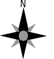
Just like your standard compass, north arrows give the orientation of the north direction. North arrows are one of the essential map elements you see on almost every map. Not to be confused with the magnetic north – our dynamic planet’s magnetic north is always changing.
North arrows point in the geographic north cardinal direction. With little effort, readers can orientate themselves northerly. Mapmaking has to consider north orientation.
18. Fill in the Surrounding Map Data
When you show orthophotography on a map, it’s sometimes clipped to a limited extent. This results in a big void of white or black on your map. This disrupts your map’s harmony. It attracts attention to these voided areas.
Although it’s not always necessary, it’s prudent to fill in this void. Google, Bing, and OpenStreetMap have free services that provide base map imagery (with attribution) to fill in the voids.
19. Cover Yourself with the Appropriate Disclaimer
Disclaimers address the legal repercussions of mapping and liability. It’s not exactly a cartographer’s dream to add to their maps. But sometimes disclaimers may be what saves you in the end.
Disclaimers can pay dividends. They are a glimmer of hope if all goes wrong on your map. Although extremely rare, disclaimers give you peace of mind. Get your standard disclaimer checked by a legal representative before adding it to a map.
20. Fill Out Data Sources Information
It’s easy to cut corners and forget to list your map’s data sources. Because to be honest, not really a lot of people tend to look at them.
Just like a thesis paper, maps can include references. During map making, you can insert footnotes with a list of sources including author and year. When someone looks at your sources, you have your bases covered.
21. Add Graticules as Handy Guiding Lines
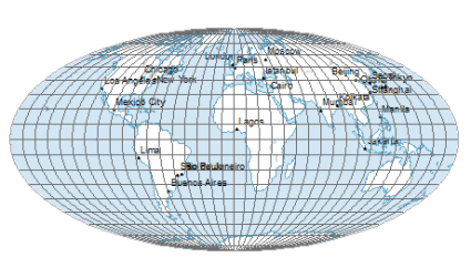
Graticules represent meridians or parallels (or lines in other projections). They are lines on your map running north-south and east-west. Measured grids are for projected coordinates.
Although graticules are not always necessary in a map, they can be handy guides for horizontal and vertical measurements. Follow a graticule and instantly understand latitude or longitude position. A map reader can estimate a feature’s coordinates by looking at graticules in cartographic maps.
22. Ensure Standard Symbology is Used
Symbology is the cartographic language that is communicated to the audience. It’s the graphic representation of real-world features on a map. We learn the map’s story through well-chosen map symbology.
One of the main goals of cartography is to ensure individuals reviewing the map can understand its significance. You instantly lose the confidence of the map reader with inconsistent symbols.
23. Use Appropriate Scale Symbology
Symbols on a map are like words in a book. But they have to be intuitive. They describe the information to the reader. And symbology has to use the appropriate scale
Some symbology is universal. Cartographers are concerned about how symbols are perceived on a map. Symbols are sometimes exaggerated in map-making so readers can quickly understand. A small-scale map could have a city represented as a point. Zoom into a large-scale map and the city is better displayed as a polygon boundary.
24. Select Colors that Reflect a Theme and Purpose
Color catches your eye. It’s usually the first place you look on a map. Your eyes will beam in on color. Color is used to clarify features. It increases design possibilities. Maps reveal information on location and attributes. Combined with color, it depicts relationships and adds visual clarity.
People respond to color differently. Blue is generally water and positivity. Green is often used for vegetation. Brown is often used for mountains and dry land. Red often represents important features. ColorBrewer is a helpful resource for choosing meaningful colors in your map-making process.
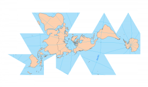
25. Think Outside the Box with Different Map Types
Poorly designed maps are difficult to understand. For example, having a thematic map with too many color shades easily frustrates readers. The idea of the map won’t be conveyed.
A choropleth map is good for population data. A climate map is good for showing temperature change. Bar graphs are good at depicting changes in numerical values. Cartographers have plenty of tools in their toolbox for selecting the right map type.
26. Carefully Select Typeface
The Comic Sans font has become the laughingstock of typeface design. There’s no place on a map for this font. Legibility is always a concern whether you use a serif or sans-serif font.
A general rule is that base features use Times New Roman and thematic features use Arial. But it depends on the map design. Is it a formal, informal, classic, or contemporary style map?
27. Limit the Number of Features
When you have too many features on your map, it quickly becomes a horrible game of “Where’s Waldo”. Because in the end, you are trying to communicate that one map purpose. As soon as you add unnecessary features, your map may be deemed a cartographic nightmare.
With too many features, information isn’t passed to the reader. It gets miscommunicated. When it’s all said and done, you may be better off splitting a map into two. Having too many features complicates your map.
28. Italicize Water Features
It’s a gimme that water is always in italics and it’s blue. You rarely see it in other formats. When you do, they seem out of place.
Rivers curve and so should your text. The slanted text shows fluidity in the text. Scale text for larger lakes. Decrease text size for smaller and less important lakes. Mapmaking has to consider font face and style when labeling different features.
29. Beware of Overlapping Text
Label placement is surprisingly one of the biggest challenges cartographers face. Readability is the ultimate goal. The key is to add contrast between the background color and the label. This ensures that your text will be readable. Halos around text can improve visibility.
With many features labeled in a small area, it can quickly become a cartographic nightmare. Labels can easily clash with one another. One option is to place text manually to avoid conflicts. Call-outs can also improve visibility.
30. Carve Out the Author’s and Reviewer’s Names to the Map
Who made the map? Who reviewed it? It’s not necessary for all map-making designs but a quick fix is to add the cartographer and reviewer names to the map.
During questions and answer time, it makes all the difference. Have pride in your work.
31. Run a Spell Check
Maps always reveal positions. But they also reveal textual information. Place names, legend items, and metadata are all in the text.
You instantly lose the respect of your audience with incorrect spelling. This simple task makes or breaks it. Check your spelling on the map and in the legend.
32. Features in Legend are Present and Singular
You learn from maps. You extract information from maps. But when a feature in your map isn’t labeled or in the legend, information is lost.
It’s good practice to manually go through entities on a map and your items listed on the legend. Plus, it’s a good habit that legend items are singular for map-making.
33. Find Balance & Harmony
You learn about map balance and harmony with experience. It’s not something you pick up after your first map.
When you learn to organize the map and other elements, you start figuring out balance. Achieving harmony is the impression of equilibrium. A well-balanced cartographic design is formed with visual weight and visual direction.
A Checklist for How To Create Meaningful Maps
This list of mapping techniques puts you light years ahead of the competition.
We’ve shown you everything you always wanted to know about map making and how to create the perfect map.
Now it’s your turn:
What crucial map elements did we forget?
What other cartographic essentials will put your map in a museum, instead of the garbage can?
Comment below and let us know.


nice summary, I just provided the link to a newbie
There is a mistake in the map for “3. Use the Appropriate Template”.
Standard time for Newfoundland and Labrador has a label of “7:30” and it should be “6:30” as there’s only a 30 minute difference from here in PEI.
Don’t worry, the author’s name is not on the map so the peeps in Newfy can’t send them any hate mail.
Simple and best guide. It would have been best to include some guide or good practice in the scale of the map and coverage section that relates to paper size in the layout and coverage area.
A handy checklist for the beginner! But a few of these are definitely optional and can be unnecessarily distracting. North orientation is so standard, I omit north arrows unless using a non-standard orientation. Scale bars should be as simple as the map’s purpose warrants (i.e. do you even need a subdivision), and in some cases also unnecessary. Graticules are also something I often intentionally omit from many maps. And your note about features could be interpreted two ways–both important. I often filter the rivers, roads, cities, etc. to include a useful level of detail for the map’s purpose. I also need to think about what additional reference/supporting data is vital to the audience understanding the story without it overwhelming the map. But again, this is a great list for people to check and think about what they’re including and omitting.
I agree with signing your work. I have a a friend that did the map work for her town when it was hit by a massive tornado and was declared a disaster area. Little did she know President Bush was going to be using her maps on his visit. It wasn’t until she saw him using one that she realized her name wasn’t on it. Now she has her name on every map she produces, what a missed opportunity.
How much map extent should be shown and how to decide the map extent? Please clarify
Great article. I think it describes all the aspects of map design.
Great resource and I appreciate you taking the time to put the list together. Your thoughts on each point within the list shed are we stated and informative. Pleasure to read.