QField: The Field Collection App for QGIS
QField is an open-source mobile data collection for Android, iOS, and macOS. You can build forms, with GPS positioning and camera integration.
QField is an open-source mobile data collection for Android, iOS, and macOS. You can build forms, with GPS positioning and camera integration.
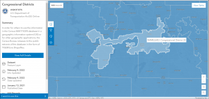
The Esri Redistricting tools provide an easy and efficient way that helps state legislatures redraw accurate redistricting boundary maps.
If you want to find the latitude and longitude of anywhere with your mobile phone, this list of GPS coordinate apps will help you get started.
These 3 field apps will provide you with the right data collection tools so you can capture survey information from your mobile device.
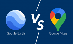
Google Maps is for local navigation and routing. Whereas Google Earth has virtual trips and guided tours around the world.
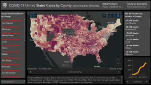
Operational dashboards are management tools for tracking, analyzing, and displaying key metrics to get insights into data and decision-making.
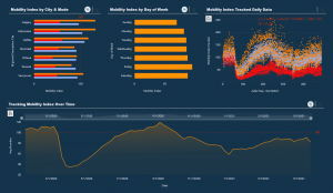
ArcGIS Insights is the fusion of spatial analysis from GIS, data science (R and Python), and BI workflows which are all integrated into one place.
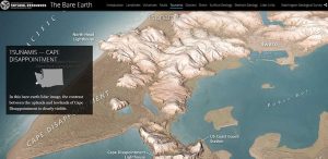
Story meet map. Story maps are an interactive way to display a particular event, issue, place, or trend with a focus on location.
Here’s a list of non-geospatial tools we’ve all got secretly in our back pockets. It’s the functionality that GIS just isn’t cut out to do!
Buckle up. Because you’re going to witness a head-to-head battle between the juggernauts of GIS software. It’s a rematch. ArcGIS Pro vs QGIS 3