Best Dashboards for Mapping

So you’re looking to build a map dashboard? But with so many map dashboard platforms, which one should you use? Well, you’ve come to the right place.
Today, we’ll count down our favorite map dashboards. We’ll show you examples. Plus, we’ll highlight each one’s unique features. Let’s get started.
Best Map Dashboards – At a Glance
The table below highlights each dashboard’s strengths and standout features:
| Dashboard | Best For | Standout Feature |
|---|---|---|
| ArcGIS Dashboards | All-in-one functionality. Best for GIS professionals | Speed and spatial data analysis |
| Tableau | Data visualization and business analysts | Interactive visualizations and ease of use |
| CARTO | Data scientists working with spatial analytics | Speed and spatial data analysis |
| PowerBI | Business intelligence, Corporate users | Integration with Microsoft products |
| QGIS Dashboard Plugin | Open source users with a GIS background | Integration with QGIS |
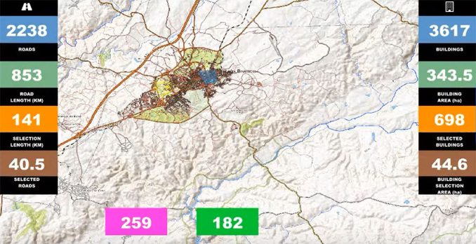
1. ArcGIS Operational Dashboards
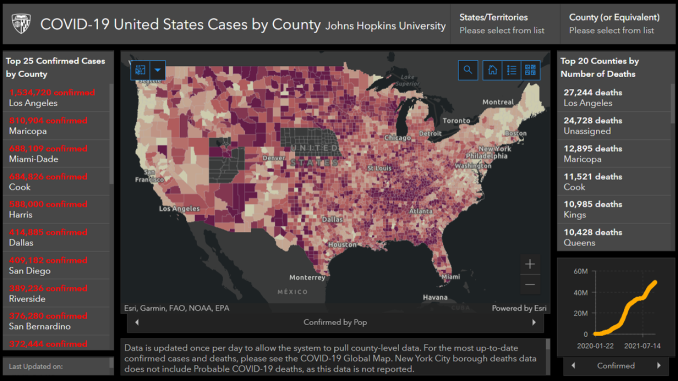
If you work in the GIS industry, this shouldn’t come as too much of a surprise. In the top spot, ArcGIS Dashboards is packed with features. Innovation is key to its success, even hosting the Johns Hopkins Covid Tracker.
Operational dashboards support a variety of data visualizations. You can display maps, lists, charts, gauges, indicators, and tables. This makes it easier to understand datasets at a glance. Users can configure these elements to present data in the most engaging way possible.
ArcGIS Dashboards brings both 2D and 3D mapping capabilities. For those looking to dive deeper into spatial analysis, it has geoprocessing and interactive 3D exploration. Finally, check out other options like “Find my location” and connectivity to ArcGIS Online.
2. Tableau Dashboards
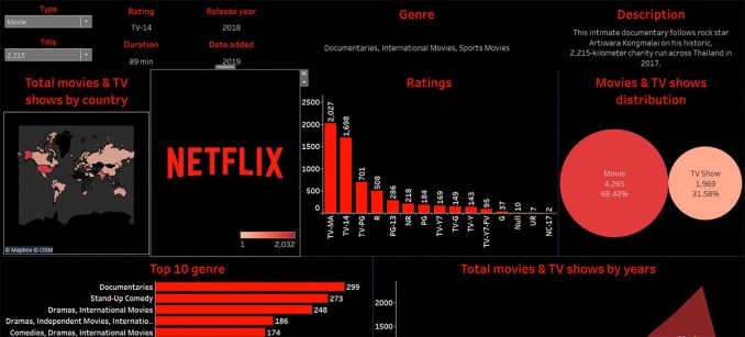
Tableau is highly regarded for its map dashboards. Customization is key as you can tailor map dashboards to your needs. The best part is interactivity with lots of available actions like this Netflix Dashboard.
There are two ways you can import data. First, you can change text to a “geographic role” if you have a table. Tableau has predefined geographic data available such as zip codes, states, provinces, cities, etc.
But what happens if you want to show watersheds? Tableau allows you to import spatial file types like Shapefiles, GeoJSON, and KML. These custom geographic overlays allow for more detailed and specific analyses.
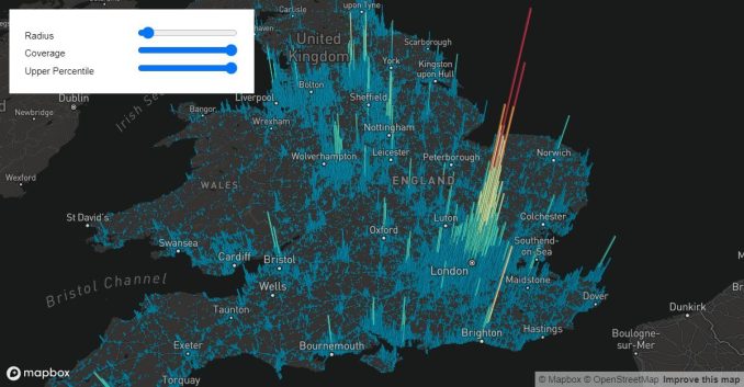
3. CARTO Dashboards
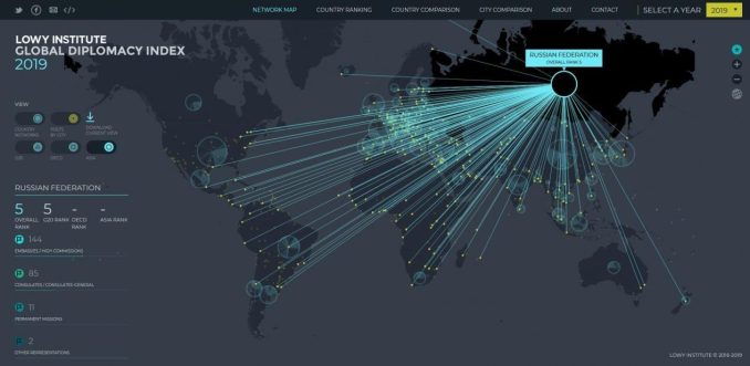
CARTO dashboards have been redesigned with a modern look and feel. As a cloud-native GIS platform, it’s designed for speed. You also gain access to over 12,000 geospatial datasets.
Here’s an example of a map dashboard with CARTO. In this use case, Vodafone uses CARTO to monetize mobile event data. In this CARTO dashboard, you can find widgets, infographics, charts, and selectors.
Additionally, CARTO Builder can integrate with major cloud data platforms. This gives you a simple UI for geospatial analysis operations with deck.gl visualization library.
4. PowerBI Dashboards
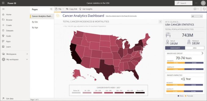
Microsoft Power BI is another platform for creating map dashboards. For those already working with Microsoft Office, PowerBI might make the most sense for you. But the map types are very basic, including choropleth, filled, and shape maps.
Powered by Bing Maps, you can configure maps with drill-down capabilities. Power BI also has integration with Azure Maps. This means you get real-time traffic information, geocoding services, and spatial analytics.
Even though you don’t have all the bells and whistles like ArcGIS Dashboards, it has a plugin to give you many of its capabilities. In partnership with Esri, the ArcGIS for PowerBI Plugin enables heat mapping, point clustering, and more. So, this is one way to expand the types of visualizations in PowerBI.
READ MORE: ArcGIS for Microsoft PowerBI
5. QGIS Dashboard Plugin
The QGIS Dashboard Plugin is still in its early stages of development. But it’s fine a long way so far. Also, it’s nice that you can integrate it with OpenStreetMap using the QuickMapServices plugin.
How this plugin works is that it uses labels anchored to the edges of your screen. It shows live information of what’s happening on the map. So if you pan, these labels update based on user interactions.
First, you build a dashboard layer. Next, you use data-defined overrides to bind label properties (such as text, color, and size) to the attributes of the dashboard layer. This allows for dynamic updates of label content and style based on the underlying data.
Hey, What About Mapbox and Google Maps?
Mapbox and Google Maps are both popular mapping services. But their approach to “dashboards” differs from Tableau, Power BI, or any of the above.
Here’s their approach to the concept of dashboards:
Mapbox Studio
Mapbox itself is more of a platform for mapping, location, and spatial analysis tools rather than a dashboard solution. It offers APIs and SDKs for developers to create custom maps and location-based services in their applications.
However, Mapbox Studio serves as a sort of “dashboard” for developers to create their own mapping applications. For example, users can design their maps and adjust the aesthetics to match their company’s branding.
So while not a dashboard tool in the traditional sense, you can integrate Mapbox into dashboard applications. This is common in custom-built dashboards or platforms like Tableau and Power BI. Each may use Mapbox to enhance its mapping capabilities.
READ MORE: 5 Best Web Mapping Platforms
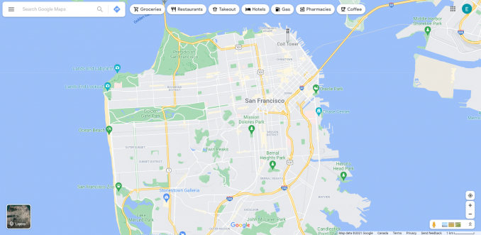
Google Maps Platform
Similar to Mapbox, the Google Maps Platform allows you to integrate its service into applications. For example, this includes Maps, Routes, and Places APIs. Like Mapbox, it doesn’t offer a “dashboard” per se for creating dashboards directly within its ecosystem.
But you can embed Google Maps into custom dashboards. Plus, you can use it alongside other business intelligence tools for geographic context.
Through its APIs, developers can integrate these mapping services into dashboard applications. For instance, you can track assets, visualize sales data geographically, or plan routes.
Best Map Dashboards for Business Intelligence
While ArcGIS Dashboards is light years ahead of the following competitors, Tableau is the next best thing for map dashboards. CARTO prides itself as more of a spatial analytics platform.
Whereas Microsoft PowerBI could work well for those already with Microsoft Office with limited mapping needs. Finally, QGIS is the best open source option today.
While neither Mapbox nor Google Maps provides dashboards in the traditional sense, you can integrate both map and location data into custom dashboards.
Now, we’d like to turn things over to you. What do you use for your business intelligence dashboard? How do you integrate them with geographic data? Please drop a comment below.